Closer Look @ SU Unis | Page 6 | Syracusefan.com

Closer Look @ SU Unis

OrangeXtreme said:
Have any of the other P5 schools "evolved" over the last 25+ years? I don't remember Michigan changing their color scheme to "Maize and Platinum", or Penn State thinking that blue helmets, blue jerseys, and blue pants was a good idea.

Ummmm... Oregon says hello. :)

And to be fair, why compare SU to Michigan and Penn State? Those schools have decades-old, iconic looks. SU has never had that. Even the unis of the 80s and 90s were constantly tweaked in small ways.
 
Btkd3G1CAAAtm7o.jpg:large

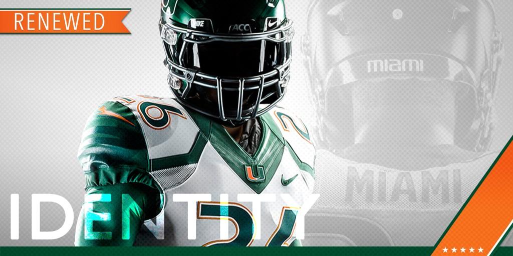
http://hurricanesports.com/fls/28700/renewedidentity/
Wow...awesome
 
Ummmm... Oregon says hello. :)

And to be fair, why compare SU to Michigan and Penn State? Those schools have decades-old, iconic looks. SU has never had that. Even the unis of the 80s and 90s were constantly tweaked in small ways.

You know who evolves every 2-3 years ... CUSA teams and Arena Football league teams.

Last time I checked, SU had over 100 years of history behind us. We shouldn't have to "evolve" to please 17-20 year old kids.

I don't mind small tweaks, but overhauling the entire color scheme is a bit much.
 
OrangeXtreme said:
...or Penn State thinking that blue helmets, blue jerseys, and blue pants was a good idea.

And we haven't done some things Penn State has done either. ;)
 
Scooch said:
Ummmm... Oregon says hello. :) And to be fair, why compare SU to Michigan and Penm State? Those schools have decades-old, icon I looks. SU has never had that. Even the unis of the 80s and 90s were constantly tweaked in small ways.

Michigan and Penn State have tweaked their uniforms, but it's been subtle so as not mess with iconic look.

The McNabb era unis are pretty iconic to me...but we couldn't resist Nike's money over the years.
 
OrangeXtreme said:
You know who evolves every 2-3 years ... CUSA teams and Arena Football league teams. Last time I checked, SU had over 100 years of history behind us. We shouldn't have to "evolve" to please 17-20 year old kids. I don't mind small tweaks, but overhauling the entire color scheme is a bit much.

Hey, I largely agree. De-emphasizing the color orange when your team IS NAMED THE ORANGE is downright silly.

But, like I said, this is the state of the game.
 
cuseguy said:
Michigan and Penn State have tweaked their uniforms, but it's been subtle so as not mess with iconic look. The McNabb era unis are pretty iconic to me...but we couldn't resist Nike's money over the years.
The 90s unis may be iconic to hardcore SU fans, but the general public sees those years as 8-9 win teams who got swamped in major bowl games. It's not like we won a national title in them or something. Maybe we should've kept the unis from 1959. What did those even look like?
 
This person is obviously a traditionalist. Georgia Tech's Russel uniforms are better then nobodies. Same with Pitt.

I think we will see some very nice combo's with ours.

If we are talking about the kids, and recruits I have little doubt far more like them, then don't like them. These kids aren't in their 40's, they don't want to wear the old looking McNabb era uniforms with the stripes on the pants and helmet.
Dude look at your avatar...
 
Have any of the other P5 schools "evolved" over the last 25+ years?

I don't remember Michigan changing their color scheme to "Maize and Platinum", or Penn State thinking that blue helmets, blue jerseys, and blue pants was a good idea.
As scooch said...Oregon. Which is ground zero for this change.
 
AZOrange said:
As scooch said...Oregon. Which is ground zero for this change.

I like the change Oregon made. Our change...not so much. Nike just has a way of screwing up our uniforms, including basketball.
 
cuseguy said:
I like the change Oregon made. Our change...not so much. Nike just has a way of screwing up our uniforms, including basketball.

No one will ever agree on everything. Those basketball unis rolled out with all the other heavy hitters wearing the same thing. KU, Duke, MSU etc. I like them, although it is due for an overhaul.
 
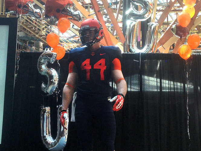
At least these new uniforms got us that awesome unveiling with these sweet balloons.

14713450-standard.jpg


I've said it before, but a lot of the issues with these uniforms could have been resolved with a better release. Seriously who does an unveiling of a totally new look at a mall on a mid-week afternoon. We might have the worst marketing in the country.
But there were balloons!
 
C'mon camp. Save us from this awful discussion. We need to argue over who the better backup at left guard will be or what position best suits Ashton Broyld... ok, never mind - that may be worse.
 
You know who evolves every 2-3 years ... CUSA teams and Arena Football league teams.

Last time I checked, SU had over 100 years of history behind us. We shouldn't have to "evolve" to please 17-20 year old kids.

I don't mind small tweaks, but overhauling the entire color scheme is a bit much.
Our 100 years are not impressive, but for a few short bursts.
Keep it fresh for the kids.
 
The defense of the new uniforms by a minority on here comes off as more extreme and aggressive than any of the criticism of the uniforms. Fact is, there are obvious flaws with the new look:

The numbers are illegible on the blue jerseys. This isn't a subjective criticism. Whether it's the 2005 road hoops jerseys, the Robinson-era blue jerseys, or those ridiculous black jerseys that Adidas pushed on Notre Dame's basketball team two years ago, dark numbers on dark jerseys don't work without some light-colored outline. Nike should be embarrassed that it continues to put out a faulty product after years of evidence that it has a functional defect. Observers are right to criticize this.

Virtually everyone agrees that branding is important. (This is why the school moved to a single athletics logo, right? And why the entire coaching staff wears the same golf shirt?) With a number of different jerseys, none of which emphasizes the sole school color or even indicates the team or school name, the team's identity cannot be readily ascertained by the average viewer. Again, this is a failure at a very basic level.

Finally, I think the grey uniforms are hideous. This holds true for a lot of teams, but especially for those who don't have grey as a primary or even complementary color.
 
Can we just mention that the 9 looks like either a lower case G or this guy turned sideways:

b2576ed0-4713-47e6-bffd-b4f3f6fa76e4.gif
 

Forum statistics

Threads
167,480
Messages
4,706,148
Members
5,908
Latest member
Cuseman17

Online statistics

Members online
381
Guests online
1,878
Total visitors
2,259


Top Bottom