Also...Tyler has CLEARLY been hitting the weight room.
I really like these jerseys, they kind of remind of Florida's, very nice.

Also...Tyler has CLEARLY been hitting the weight room.
Joe is 5'9.
And the last time I saw him he was almost 5'9 wide.
Joe was a giant on the field (pun intended) but no way he's taller than 5'6" or 5'7".
I think it's the same design, just looks more prominent.
I like them...just wish the outline on the numerals were the same as the outline of the letters on the word Orange.
So long, platinum! I hope!
Wish it said SYRACUSE
It's the quad (up between the shoulders) and...is that the Hall of Languages, or Crouse? I can't tell. Either way, it's campus.What the heck is that design supposed to be anyway??
If Lydon is wearing dark undergarments that might explain the enhanced contrast with the design.I think it's the same design, just looks more prominent.
Also...Tyler has CLEARLY been hitting the weight room.
Am I alone in thinking that ain't Tyler? I believe Mr. Lydon is caucasian, no?
Am I alone in thinking that ain't Tyler? I believe Mr. Lydon is caucasian, no?

Am I alone in thinking that ain't Tyler? I believe Mr. Lydon is caucasian, no?
at least the numerals aren't the crazy TRON/ROLLERBALL font like the foozballers.I like them...just wish the outline on the numerals were the same as the outline of the letters on the word Orange.
Every time they do this (like on past lax jerseys) it looks to me like they combined two different styles by accident.
SUOrange44

Nice touch Shark... great tune w/ Trey slayin' it.
I'm pretty sure it's just the shadows that are making it look like that.
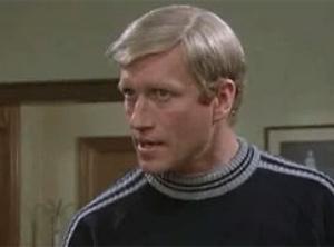

Am I alone in thinking that ain't Tyler? I believe Mr. Lydon is caucasian, no?
Nice touch Shark... great tune w/ Trey slayin' it.

Exactly.I like them...just wish the outline on the numerals were the same as the outline of the letters on the word Orange.
SUOrange44
It's him.Chalk me up as agreeing. I don't think it is him either.

