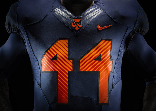
I think the 44 degree lines in the numbers make them tougher to read (it shades the numbers blue). But I like the blue color of the material, and love the helmet ( that's not to say I would not like orange unis better, just that this blue color works). For what it's worth, I had two different buddies, both avid college football fans of other teams, text me to say they liked the unis during/after the game when they saw the highlights. The lines in the numbers are good ideas in theory, but it needs to be a brighter color matching the color of the number, not the jersey color...