New Uniforms Truly Horrible | Page 5 | Syracusefan.com

New Uniforms Truly Horrible

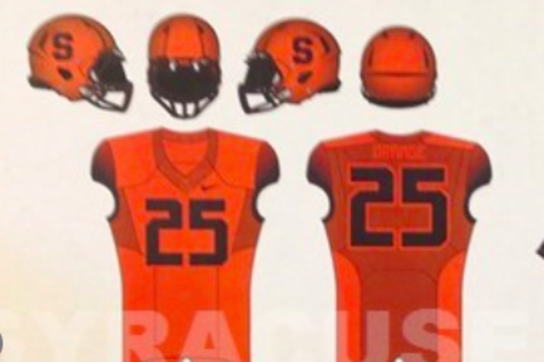
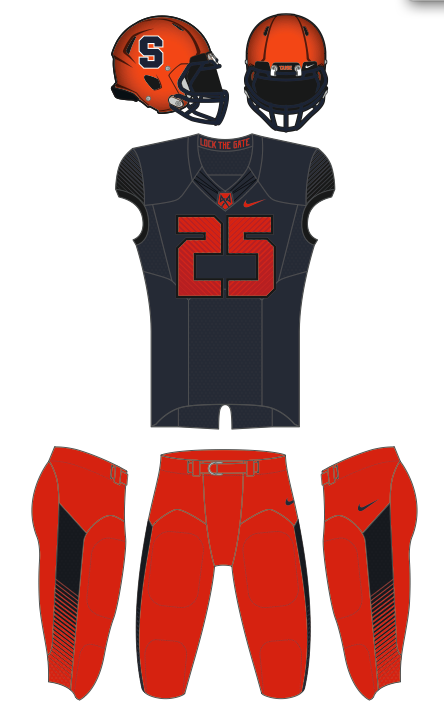
You realize that the orange ones may or may not be ready/used this year and more importantly they will be the one off? You see what the home uni's will be right? So putting aside any design likes or dislikes, tell me why the orange pant or jersey or both couldn't be brought out today and introduced as the home uni?

It's tiring listening to people say get with the times. The biggest issue is not design, it's color usage. We already dropped MEN from the Orange. May as well drop the Orange now too.

I totally agree with you. I'd swap the blue out for the orange in a second. Actually just posted the same thing.
 
I totally agree with you. I'd swap the blue out for the orange in a second. Actually just posted the same thing.

But either way, we are all going to show up and root for the team right? So then it really doesnt matter.
 
at least its not this throwback
NYXXSU7475.jpg
 
My 14 year old son just texted me. He is the kind of kid that loves new uniforms. He spends hard earned dough on the latest USA soccer jerseys and is in tune with all of the changes going on with college unis now. He's always showing me pics and saying how cool some of the new designs looks...

...and he hates the new SU uniforms. Says the numbers look weird.

He's 14 and he hates them. I'm 48 and I hate them.

But if we win...I'll be ok with the white ones.
my lil nephew just said the same but does that prove anything? He also doesnt like miami's uniforms. They are not suppose to just like them because they are young. lol
 
I agree the color scheme is wacky. The white ones are the only ones I am sort of ok with but they still look like we are trying to be the SU Bengals. The gray ones are god awful and the blue ones I am agnostic. The fact orange is not in the lineup with a blue helmet or even the white helmet is just ehh. And all orange with metallic helmets and no S would be cool too. I hope the kids like em.. if they do then great. If not what a gigantic waste of time and money.
 
By adding the Virginia Tech maroon accent, they completely wrecked these as well. Did anyone do any research at all before designing these?

I will give props for the helmet designs, which look good, excepting the duct tape abomination.

I also want to give them credit for not including the Penn State uniform as an option as well. They missed a golden opportunity with the all white uniforms...if they did them with dark blue, they could have really done their job well.

The all duct tape unis are going to be endorsed by AARP, who will sponsor Senior Day at the Dome the first game the team wears that flavor. My understanding is that, armed with these senior friendly uniforms, we are going to go after the older crowd market aggressively, with the long term goal of becoming known as Syracuse, Grandpa's Team. The great thing about targeting seniors is that a lot of them forget they already donated and do it again and again and again. We finally have a reason to root for Alzheimer's.

When is the next re-design? Next month, I hope.
 
I am 17 and personally these are pretty sweet looking. I bet they will grow on you, because at first I was a little weary. If you have not watched the video on www.suathletics.com you HAVE TOO, makes you appreciate them more.
 
Nike designers
th


The uniforms look OK to me, except for the shape of the numbers. As Toga suggests, it looks like the numbers were drawn by tots. I like the idea of the "NY" on the helmet and the nod to the 10th Mountain Division on the jersey.
 
Who got the kickback on these, Call Reebok, They look like Starship Troopers... Phew!
 
The ridiculousness of taking each color and combination and comparing it to another school is getting extreme. Stop it.
 
I really just hate the numerals. Everything else I'm okay with. They need a focus group for these things. I don't understand how you can spend all this time and money and have it be such a failure. Fix the numbers!
 
Full_Rebar said:
Is Shafer really going to say we showed these mock-ups to recruits and they laughed? I know kids like swag and they different options are what they are looking at- more gear for them. Some of the combinations work well- all Blue is terrible and I don't care if the team likes the look. Just because I don't match my baseball hats to my sneakers every day and think Outkast is better than 2Chainz doesn't mean my opinion is pointless. SU lacrosse is a great example of how you can mix in new looks with plenty of swag yet still maintain a tradition/brand. SU would have been wise to have shown the orange jerseys and had mannequins at Destiny showing all the possible combinations- that would have changed perception drastically...but it's DG's tradition to half-ass even the good ideas.

So Shafer and the recruits are lying? They secretly hate them?
 
And that's where I'm left at - confused.
I like some of the uniform combos a lot, they just don't happen to be the ones displayed today. That's mind blowing to me that the AD literally chose my least favorite ones (with the exception of all white) and paraded them around.
 
I like some of the uniform combos a lot, they just don't happen to be the ones displayed today. That's mind blowing to me that the AD literally chose my least favorite ones (with the exception of all white) and paraded them around.

Gross was no where near the mall today ... he's in Greensboro at ACC meetings.

The orange uniforms are still in production. Wait until the Fall.
 
the only difference between these jerseys and our new ones is the numbers, but do the long numbers really going to make or break Cuse football?

Correct, and the color gradient in the numbers, and the zebra stripes on the numbers, and the zebra stripes on the sleeves, and the panels with the gradient and zebra stripes on the pants, and the monochrome helmets with the stripes removed...

Outside of that, they're basically the same!
 
Correct, and the color gradient in the numbers, and the zebra stripes on the numbers, and the zebra stripes on the sleeves, and the panels with the gradient and zebra stripes on the pants, and the monochrome helmets with the stripes removed...

Outside of that, they're basically the same!
you can barely see those stripes. You only notice them when you look at a close up. You wont see them from a distance. I dont think anyone is gonna be a watching a cuse football game, pause it and zoom in to notice the stripes
 

Similar threads

    • Like
Orangeyes Daily Articles for Monday for Football
Replies
5
Views
677
    • Like
Orangeyes Daily Articles for Monday for Football
Replies
5
Views
523
    • Like
Orangeyes Daily Articles for Wednesday for Football
Replies
9
Views
467
    • Love
Orangeyes Daily Articles for Monday for Football
Replies
5
Views
544

Forum statistics

Threads
167,591
Messages
4,713,887
Members
5,909
Latest member
jc824

Online statistics

Members online
345
Guests online
2,601
Total visitors
2,946


Top Bottom