Ranking the uniforms that Syracuse has used in the last 20 years... | Page 2 | Syracusefan.com

Ranking the uniforms that Syracuse has used in the last 20 years...

Full_Rebar said:
Agree and I'd be fine with an alternate look (all-whites/all-grey/orange jersey and chrome helmet) that was used from time to time.

Ya I would like a totally crazy, out of the box one-off. Something similar to the fan concept helmet that was posted the other day. My thoughts if you are going to go for an alternate, you might as well go all in.
 
Ya I would like a totally crazy, out of the box one-off. Something similar to the fan concept helmet that was posted the other day. My thoughts if you are going to go for an alternate, you might as well go all in.

I know I'm alone on this, but I liked those digital camo hoops unis that SU wore for the Midway game. I wouldn't mind an Armed Forces Day uniform that was based on that in someway. I know a full fb uni might be too much, but..it's crazy and at least something that could tie in with the program and Ft. Drum
 
I know I'm alone on this, but I liked those digital camo hoops unis that SU wore for the Midway game. I wouldn't mind an Armed Forces Day uniform that was based on that in someway. I know a full fb uni might be too much, but..it's crazy and at least something that could tie in with the program and Ft. Drum

If we would go back to the 2011 uni's and have a camo alternate for a game, that would be perfect. It would also make sense.

These uni's last year were modern/hip/neato/trendy, but some of the combo's were outright horrendous. Quite embarrassing actually.

army-11-camo-frankdibrango-620x1083.jpg


Seeing Ft Drum is Army, keep it something like this with some ORANGE mixed in. Not blue, not platinum... Orange.
 

Attachments

  • upload_2015-3-4_7-44-40.jpeg
    upload_2015-3-4_7-44-40.jpeg
    8.9 KB · Views: 122
My three unpopular opinions:

1.
Hunt.jpg

These are among my favorites.

2.
15736455-mmmain.jpg

I love the shade of orange we use for these helmets.

3.
-e0e2eb640103a8c6.jpg

I actually kinda liked the gradient helmets. I think we pulled them off pretty well and 1000000 times better than the Jaguars did.
 
These are the ones we need.

View attachment 37617

These are basically the up to date McNabb era uniforms that everyone likes. We never should have moved off these. The McNabb ones with all the stripes are too outdated.

Yep! Though I'd still like a subtle tweak and go back to the navy facemask vs. grey...and maybe incorporating that new cool military 44 logo too. For me, that would be perfection!
 
Those schools are atop the most premier college football brands. We are not. Teams that aren't value sizzle / flash over tradition. :noidea:

Our biggest problem is the association with Nike, and the crappy options they give us.


Actually, when it comes to merchandise sales, we are way up there for a private school.
 
You all know how I feel.

Give me the 1992 Fiesta Bowl look.


Fiesta Bowl Orange.jpg


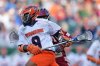
Or, the Ryan Nassib look.

NassibWindsUp.jpg


For those who dismiss the idea that the classic look should be honored in the same way that Alabama, Auburn, USC, and Texas honor their traditional look, consider this.

While wearing the Coach Mac uniforms - with the subtle changes we recognize - the Orange went to the Cherry, Sugar, Hall of Fame (2), Peach, Gator, Fiesta (2), Liberty, Orange, Music City, and Champs Bowls.

And during that time produced the program some of the greatest players ever to play on the Hill - McPherson, Johnston, Moore, Graves, McNabb, Harrison, Gedney, Green, Gregory, Paul, Reyes, Philcox, Hill, Kane, Darius, Roland Williams, Wholabough, Adam Terry, Abrams, and on and on and on.

While wearing the Marrone version of the Coach Mac uniform, the Orange went to and won two Pinstripe Bowl games in three years and produced the likes of Chandler Jones, Justin Pugh, Delone Carter, Sean Hickey, S. Thomas, et al.

The classic look is associated with great success and great players - maybe not quite Texas or Alabama or USC - but great success.

The Robinson and Shafer uniforms are associated with utter failure.

Go back to the classic look and stop promoting the generic Nike look.
 
Marsh01 said:
The best. Go back to it

Would look great as a retro one-off. The Nassib era were just as classy - but didn't look dated.
 
The lacrosse uniforms always look so nice, not sure why it's so much harder for the football team. I like the classic 90's look. Maybe we can incorporate some generic logo into our football helmets like some sort of reference to the saltine warriors or a lightning bolt or something
 

Attachments

  • th.jpg
    th.jpg
    46 KB · Views: 130
  • 14284568-standard.jpg
    14284568-standard.jpg
    46.7 KB · Views: 116
via nunesmagician.com
 

Attachments

  • 169492947.0.jpg
    169492947.0.jpg
    44.5 KB · Views: 136
I dont understand why we didn't just take the Nassib-Era jerseys and make different color combos...it would've appealed to the recruits who wanted to mix and match, and would've gave some sustainability to our "brand."

Also the block "S" IMO, is the best thing Gross has done here. Now we're finally not one of those teams that's changing their logo every 5 years...and doesn't have the same logo in basketball and football. Remember this debacle?


2770.gif
ghhy5onlo6qjjyc98hcb.png
 

Forum statistics

Threads
167,623
Messages
4,716,696
Members
5,909
Latest member
jc824

Online statistics

Members online
302
Guests online
2,557
Total visitors
2,859


Top Bottom