
You are using an out of date browser. It may not display this or other websites correctly.
You should upgrade or use an alternative browser.
You should upgrade or use an alternative browser.
Why does Nike only make our uniforms look bad: Wake Forest new jerseys
- Thread starter Alsacs
- Start date

Full_Rebar
All American
- Joined
- Jul 10, 2013
- Messages
- 4,073
- Like
- 4,213
If you really analyze them, the design s on the collar and sleeves tell me it's the same exact jersey. The only trouble here is the numbers.
But they honor the past...
"The black and gold uniform features a new custom number font honoring the university's founding in 1834. The numbers feature angled notches at 18 and 34 degrees, top and bottom respectively."
We all agree their should be more orange, but our jersey numerals are just flat out XFLish junk. I want to be able to clearly see the number on the jersey the stupid multi-colorness and the vertical 44 degree lines are just dumb.
It isn't hard if Nike just made numerals white with blue/orange piping depending on the home color and made the numerals either blue/orange on the white jersey with the other color as the piping.
Our new jerseys just suck as I would never buy one. I have #1 from the 2004 era style if I would wear one to the game.
rosconey
All Conference
- Joined
- Oct 17, 2011
- Messages
- 2,532
- Like
- 1,292
some one at nike lost a bet -and has been playing with our jerseys since then as payback -
only logical reason a team called the orange doesnt have any or very little orange in most uniforms-
we always have the ugliest jerseys while other schools that wear orange have nice looking ones-
only logical reason a team called the orange doesnt have any or very little orange in most uniforms-
we always have the ugliest jerseys while other schools that wear orange have nice looking ones-

anomander
Living Legend
- Joined
- Nov 30, 2012
- Messages
- 14,837
- Like
- 28,326
These were absolutely perfect. Sucked we only wore them for a year, then started messing around with those blue pants, and stupid fade helmet.
jekelish
Living Legend
- Joined
- Aug 16, 2011
- Messages
- 22,278
- Like
- 36,915
If we wanted to offer Lex with our numbers, they'd be way too big to actually fit on the jersey.We should honor SU alum Lexington Steele and angle our numbers at 69 degrees.
Millhouse
Living Legend
- Joined
- Aug 16, 2011
- Messages
- 29,641
- Like
- 35,308
our numbers are strangely long so maybe that tribute is already thereWe should honor SU alum Lexington Steele and angle our numbers at 69 degrees.
Eric15
Living Legend
- Joined
- Aug 28, 2011
- Messages
- 29,944
- Like
- 111,610
These were absolutely perfect. Sucked we only wore them for a year, then started messing around with those blue pants, and stupid fade helmet.
I loved them too, but didn't we wear them for three years... 2010-2012?
Hoo's That
Living Legend
- Joined
- Aug 15, 2013
- Messages
- 24,473
- Like
- 64,816
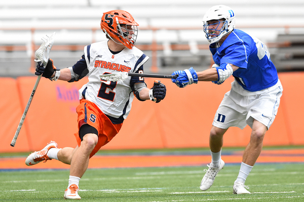
I think both of us have had them butcher our MLax jerseys. I really hate our blue panel home jerseys. I'm shocked that our orange-outline number blue jerseys are still legal under the rule change that came in this year.I hate Nike.
RF2044
Living Legend
- Joined
- Aug 15, 2011
- Messages
- 30,872
- Like
- 99,953
We all agree their should be more orange, but our jersey numerals are just flat out XFLish junk. I want to be able to clearly see the number on the jersey the stupid multi-colorness and the vertical 44 degree lines are just dumb.
It isn't hard if Nike just made numerals white with blue/orange piping depending on the home color and made the numerals either blue/orange on the white jersey with the other color as the piping.
Our new jerseys just suck as I would never buy one. I have #1 from the 2004 era style if I would wear one to the game.
Agreed with the XFL comparison. Our uniforms are bad. I like the helmets, but Nike makes our uniforms too busy with all the gradient shading and the diagonal lines across the numbers. Its like some designer decided to incorporate every graphic design trick they knew into our uniforms.
Sometimes less is better.
OrangeXtreme
The Mayor of Dewitt
- Joined
- Aug 15, 2011
- Messages
- 225,732
- Like
- 403,454
I think both of us have had them butcher our MLax jerseys. I really hate our blue panel home jerseys. I'm shocked that our orange-outline number blue jerseys are still legal under the rule change that came in this year.
IMO, there's nothing wrong with our LAX uniforms this year.
Hoo's That
Living Legend
- Joined
- Aug 15, 2013
- Messages
- 24,473
- Like
- 64,816
Yes. The white ones you wear now do look really good. To me, they're reminiscent of the Reds and Pirates classic sleeveless unis. There were some in the past that both of us wore that made me wonder if Nike's designers had all their taste in their mouths.IMO, there's nothing wrong with our LAX uniforms this year.
OrangeXtreme
The Mayor of Dewitt
- Joined
- Aug 15, 2011
- Messages
- 225,732
- Like
- 403,454
Yes. The white ones you wear now do look really good. To me, they're reminiscent of the Reds and Pirates classic sleeveless unis. There were some in the past that both of us wore that made me wonder if Nike's designers had all their taste in their mouths.
We went all sleeveless this season ... three vests (white, orange, blue), three t-shirts, three helmets, and three shorts. All interchangeable.
Although the all-blue look sucked.

Full_Rebar
All American
- Joined
- Jul 10, 2013
- Messages
- 4,073
- Like
- 4,213
Everytime SU tries an all-blue look, two things occur: 1) it looks horrible and 2) that team seems to lose
MSOrange
2020 Cali Award Winner, Regular Season Record
- Joined
- Aug 27, 2011
- Messages
- 50,135
- Like
- 122,597
rosconey
All Conference
- Joined
- Oct 17, 2011
- Messages
- 2,532
- Like
- 1,292
its all done to trick the other team into thinking they are playing another team-And nobody recognizes the Syracuse Orange because they have all blue!
same tactics used by rommel in ww2 and latter by the portuguese in vietnam
SU68
Starter
- Joined
- May 5, 2013
- Messages
- 1,481
- Like
- 1,943
I didn't like it either, but in retrospect, it was probably a good thing that nobody recognized us in 2014.And nobody recognizes the Syracuse Orange because they have all blue!