OrangeXtreme
The Mayor of Dewitt
- Joined
- Aug 15, 2011
- Messages
- 215,340
- Like
- 375,431

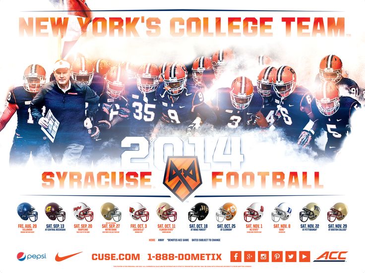
I like the look of it and even that weird Nike home place thing looks okay here, away from their unfortunate uniforms.
I like the coming-out-of-the-tunnel look. I just wish it was a bit more in your face instead of so distant looking.I like the look of it and even that weird Nike home place thing looks okay here, away from their unfortunate uniforms.
Would have thought they would try and feature more of the captains here. I guess you can't have everything...
the Syracuse Blue
:bang::bang::bang::bang::bang::bang::bang:
Damn, Shafer looks like Marrone in this one.
Damn, Shafer looks like Marrone in this one.
Doesn't say "Orangemen"
-1
Kinda weird that we'd have a 2014 promo poster with 2013 jerseys
They have them. That's what they'll be wearing this season, the season that the posters are promoting. Shooting a promo picture with a dozen players isn't hard.The 2014 jerseys haven't been worn yet. Maybe they should wear the 2020 jerseys from the future.
They have them. That's what they'll be wearing this season, the season that the posters are promoting. Shooting a promo picture with a dozen players isn't hard.
Now if we had our own secret handshake that might add a little gravitas to this thing.
Is it the high five?You don't know the secret handshake?!?!
Is it the high five?