You are using an out of date browser. It may not display this or other websites correctly.
You should upgrade or use an alternative browser.
You should upgrade or use an alternative browser.
All Whites Today
- Thread starter Upstate
- Start date
OburgOrange
Living Legend
- Joined
- Aug 27, 2011
- Messages
- 21,683
- Like
- 65,167
Not enough blue
orange79
Internet Sleuth
- Joined
- Aug 20, 2011
- Messages
- 41,852
- Like
- 129,128
Not sure many of us will still be around at that pointMaybe one of these days they'll look like Syracuse.
- Joined
- Aug 16, 2011
- Messages
- 98,121
- Like
- 195,043
OburgOrange
Living Legend
- Joined
- Aug 27, 2011
- Messages
- 21,683
- Like
- 65,167
I agree winning is more important, but why can't we have both? Win looking like the Syracuse Orangeman.
KaiserUEO
2022 and 2x ESPN Tourney Challenge Winner
- Joined
- Aug 26, 2011
- Messages
- 18,917
- Like
- 22,956
except we cant.White, blue, grey, orange, purple... who gives a damn? Let's just win a fecking football game.
so lets at least represent ourselves properly.
Blaster
2nd String
- Joined
- Aug 29, 2011
- Messages
- 592
- Like
- 127
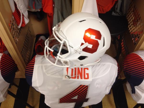
This is my favorite. Hope we keep these as are road unis for a while. Hell if we go 2-0 with them today we should wear them at home also.
Such a great look.
Like these all white uniforms. Easily the best combination currently available.
Hate all the other combinations. Especially now that they removed the white outlining on the orange helmets. Home jerseys remind me of 2005. Nobody wants to relive that. Ugh.
Hate all the other combinations. Especially now that they removed the white outlining on the orange helmets. Home jerseys remind me of 2005. Nobody wants to relive that. Ugh.
TheCusian
Living Legend
- Joined
- Sep 24, 2012
- Messages
- 22,782
- Like
- 33,675
Nick44 said:Like these all white uniforms. Easily the best combination currently available. Hate all the other combinations. Especially now that they removed the white outlining on the orange helmets. Home jerseys remind me of 2005. Nobody wants to relive that. Ugh.
I think the removal of the white outline on the S is a huge improvement. The blue home with orange helmet is growing on me.
Like others have said, I'd love to see more orange in the uni combinations. Oregon St and Illini look sharp.I think the removal of the white outline on the S is a huge improvement. The blue home with orange helmet is growing on me.
What bothers me the most, however, is the fugly number font that desperately needs to be outlined.
orangeinjersey
All Conference
- Joined
- Feb 16, 2012
- Messages
- 3,798
- Like
- 4,068
well, we did win the last time we wore these, so theres that
TheCusian said:I think the removal of the white outline on the S is a huge improvement. The blue home with orange helmet is growing on me.
I'm completely the opposite. I think the removal of the outline on both helmets (white on the orange, blue on the white) is a huge downgrade. Makes it look second rate and cheap in my opinion.
What is really weird is how all three helmets had the outline at the unveiling, and the Orange helmet had it the first game and that was it. Like it or not, why the lack of consistency?
KaiserUEO
2022 and 2x ESPN Tourney Challenge Winner
- Joined
- Aug 26, 2011
- Messages
- 18,917
- Like
- 22,956
the NFL outlawed having a 2nd helmet, even for one offs or a throwback day, to prevent concusions.
Syracuse has 3 helmets, thus promoting concusions. they dont care.
i know theyre cattle, the school knows theyre cattle, but for some god unkown reason theyre deliberatly ruining their meal ticket.
dress them properly for the slaughter, please.
Syracuse has 3 helmets, thus promoting concusions. they dont care.
i know theyre cattle, the school knows theyre cattle, but for some god unkown reason theyre deliberatly ruining their meal ticket.
dress them properly for the slaughter, please.
NineOneSeven
2018-19 Iggy Hoops Leader Scorer
- Joined
- Aug 30, 2011
- Messages
- 41,838
- Like
- 72,416
And not a single %#^ was given that day
jekelish
Living Legend
- Joined
- Aug 16, 2011
- Messages
- 22,278
- Like
- 36,915
Agreed - having such a lack of accent colors and outlining of the numbers makes the blue jerseys look like practice jerseys.I'm completely the opposite. I think the removal of the outline on both helmets (white on the orange, blue on the white) is a huge downgrade. Makes it look second rate and cheap in my opinion.
What is really weird is how all three helmets had the outline at the unveiling, and the Orange helmet had it the first game and that was it. Like it or not, why the lack of consistency?
SUfaninAZ
All Conference
- Joined
- Aug 17, 2011
- Messages
- 2,232
- Like
- 4,128
Who are the Orangemen you speak of?:noidea:I agree winning is more important, but why can't we have both? Win looking like the Syracuse Orangeman.

- Joined
- Aug 16, 2011
- Messages
- 98,121
- Like
- 195,043
Lits44 said:Makes it look second rate and cheap in my opinion
Because they are second rate and cheap. We might have some of the worst uniforms in college football. I used to brag we had some of the best. Heck, even the things they put in sale to the public look like a cheap tshirt.
Last edited:
GoSU96
Living Legend
- Joined
- Aug 17, 2011
- Messages
- 21,608
- Like
- 42,162
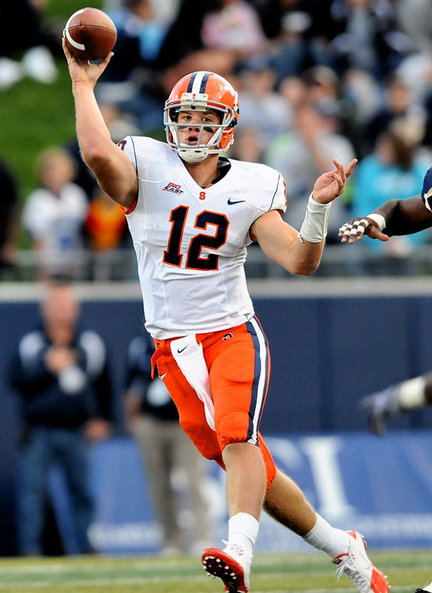
Swap out the white helmet for an orange one and I'm okay with these. I'd prefer orange pants with them too, but what do I know?
You mean something like this?

Similar threads
- Replies
- 2
- Views
- 365
- Replies
- 23
- Views
- 4K
