
You are using an out of date browser. It may not display this or other websites correctly.
You should upgrade or use an alternative browser.
You should upgrade or use an alternative browser.
New Football Uni's
- Thread starter Orangejet
- Start date
The UNC friends in my office HATE their new uniforms, and loved the classic ones they wore typically at home because they were the same jerseys since the 1960's except the size of the white font on the baby blue(note I refuse to call it Tarheel blue). The new primary home jerseys are horrible in their eyes because of the black font. I agree with them I don't like teams incorporating black into their uniforms unless its one of their primary colors. I don't mind black alternate jerseys or the dark blue alternate jerseys UNC wore, but to go these jerseys below just suck. All, I want for Syracuse is to have an Orange alternate jersey that doesn't suck like the ones we wore during the GROB 2006 season.

Black Alternate jersey

New home jersey

New road jersey

Black Alternate jersey
New home jersey
New road jersey
ImperialOrange
Living Legend
- Joined
- Aug 26, 2011
- Messages
- 18,340
- Like
- 39,424
Those UNC alternate jerseys look like the drunken love child of Maine and Rhode Island uni's

Would love to see Syracuse have an alternate Orange jersey that took their styling from the hoops or Lax uni's
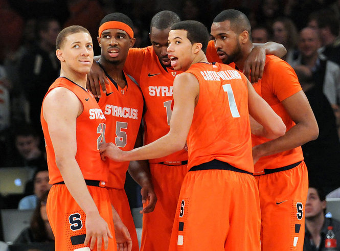

Would love to see Syracuse have an alternate Orange jersey that took their styling from the hoops or Lax uni's
Those UNC alternate jerseys look like the drunken love child of Maine and Rhode Island uni's
Would love to see Syracuse have an alternate Orange jersey that took their styling from the hoops or Lax uni's
These are already sold by Nike and are perfect Orange alternates.
ImperialOrange
Living Legend
- Joined
- Aug 26, 2011
- Messages
- 18,340
- Like
- 39,424
View attachment 3164
These are already sold by Nike and are perfect Orange alternates.
I hate the shoulder stripes for fairly obvious reasons.
Would be cool to see football pants take styling from the basketball shorts.
sutomcat
No recent Cali or Iggy awards; Mr Irrelevant
- Joined
- Aug 15, 2011
- Messages
- 26,419
- Like
- 114,833
When the UNC people say Tarheel Blue, they mean Columbia Blue, because that is where they stole it from.The UNC friends in my office HATE their new uniforms, and loved the classic ones they wore typically at home because they were the same jerseys since the 1960's except the size of the white font on the baby blue(note I refuse to call it Tarheel blue). The new primary home jerseys are horrible in their eyes because of the black font. I agree with them I don't like teams incorporating black into their uniforms unless its one of their primary colors. I don't mind black alternate jerseys or the dark blue alternate jerseys UNC wore, but to go these jerseys below just suck. All, I want for Syracuse is to have an Orange alternate jersey that doesn't suck like the ones we wore during the GROB 2006 season.
Black Alternate jersey
New home jersey
New road jersey
Columbia should get the credit (if credit is due for making grown men wear a baby color) for originating it.
No one asked me but I think it is hard to look fierce wearing Columbia blue. Very hard. I am not seeing it here.
JKinPhilly
All Conference
- Joined
- Aug 26, 2011
- Messages
- 3,398
- Like
- 7,629
I can't help it...every time I see a discussion about uniforms and possible changes this horrific image comes to mind

ImperialOrange
Living Legend
- Joined
- Aug 26, 2011
- Messages
- 18,340
- Like
- 39,424
I really like our current uni's. If I hade one tweak though, it would be orange numbers with blue trim on our away kits.
We had white with orange numbers during the McNabb era and they were pretty awesome.

We had white with orange numbers during the McNabb era and they were pretty awesome.
SoBeCuse
Living Legend
- Joined
- Aug 29, 2011
- Messages
- 12,140
- Like
- 14,887
Those shoulder stripes should begin and end with USC. As synonymous as Alabama or the Penn St unis in terms of tradition and brand. Iowa St especially should be ashamed of themselves for using those stripes in the same color scheme.
I loved these road uniforms, I liked them better than blue font we used during McNabb's FR and Sophomore years.I really like our current uni's. If I hade one tweak though, it would be orange numbers with blue trim on our away kits.
We had white with orange numbers during the McNabb era and they were pretty awesome.
We had Orange Jersey with this font that weren't the best of looking, but were better than the GRob 2006 one posted above.
Senior Day 2004 and P's last home game and sadly the students of which I was one(but I refused too) stormed the field.
Faegan
All Conference
- Joined
- Aug 26, 2011
- Messages
- 3,074
- Like
- 3,061
I love those uniforms and want those returned with MINOR tweeks to get them up to date to
avoid players getting pulled down and take advantage of other tech improvements. Love them.
(oh yeah, don't forget to add ACC and pull Big East.)
avoid players getting pulled down and take advantage of other tech improvements. Love them.
(oh yeah, don't forget to add ACC and pull Big East.)
I really like our current uni's. If I hade one tweak though, it would be orange numbers with blue trim on our away kits.
We had white with orange numbers during the McNabb era and they were pretty awesome.
ImperialOrange
Living Legend
- Joined
- Aug 26, 2011
- Messages
- 18,340
- Like
- 39,424
Those shoulder stripes should begin and end with USC. As synonymous as Alabama or the Penn St unis in terms of tradition and brand. Iowa St especially should be ashamed of themselves for using those stripes in the same color scheme.
Funny since I always think LSU when I see them. Regardless though, I 100% do not think Syracuse.
I think of LSU as well just because they always wear their white jerseys and gold and purple stripe is easy to identify, but looking at USC's jersey I see the stripe. I wouldn't mind getting rid of the stripe from our jersey and just going back to the McNabb era jerseys and get rid of the block S off the helmet and just have the solid Orange helmet.Funny since I always think LSU when I see them. Regardless though, I 100% do not think Syracuse.
ImperialOrange
Living Legend
- Joined
- Aug 26, 2011
- Messages
- 18,340
- Like
- 39,424
I think of LSU as well just because they always wear their white jerseys and gold and purple stripe is easy to identify, but looking at USC's jersey I see the stripe. I wouldn't mind getting rid of the stripe from our jersey and just going back to the McNabb era jerseys and get rid of the block S off the helmet and just have the solid Orange helmet.
I don't mind the little stripes on the shoulder now. Didn't like them when I saw the jerseys at first but they look BA when our players suit up in them w/ shoulder pads.
SoBeCuse
Living Legend
- Joined
- Aug 29, 2011
- Messages
- 12,140
- Like
- 14,887
Funny since I always think LSU when I see them. Regardless though, I 100% do not think Syracuse.
I clearly forgot about LSU. Definitely a brand and tradition. Thanks for mentioning them.
ImperialOrange
Living Legend
- Joined
- Aug 26, 2011
- Messages
- 18,340
- Like
- 39,424
I clearly forgot about LSU. Definitely a brand and tradition. Thanks for mentioning them.
All good. U$C reminds me of their colors and the helmets when I think of their uni's. I couldn't have even told you they had shoulder stripes.
SoBeCuse
Living Legend
- Joined
- Aug 29, 2011
- Messages
- 12,140
- Like
- 14,887
All good. U$C reminds me of their colors and the helmets when I think of their uni's. I couldn't have even told you they had shoulder stripes.
Yeah, for sure the colors and those awesome helmets. I guess it's more the one band/stripe as opposed to the the actual stripes on LSU.
bnoro
Lurker
- Joined
- Aug 15, 2011
- Messages
- 11,270
- Like
- 32,669
The UNC friends in my office HATE their new uniforms, and loved the classic ones they wore typically at home because they were the same jerseys since the 1960's except the size of the white font on the baby blue(note I refuse to call it Tarheel blue). The new primary home jerseys are horrible in their eyes because of the black font. I agree with them I don't like teams incorporating black into their uniforms unless its one of their primary colors. I don't mind black alternate jerseys or the dark blue alternate jerseys UNC wore, but to go these jerseys below just suck. All, I want for Syracuse is to have an Orange alternate jersey that doesn't suck like the ones we wore during the GROB 2006 season.
looks like the carolina panthers
I hate the duct tape numbering.Those UNC alternate jerseys look like the drunken love child of Maine and Rhode Island uni's
Would love to see Syracuse have an alternate Orange jersey that took their styling from the hoops or Lax uni's
OrangeMojo
All Conference
- Joined
- Aug 26, 2011
- Messages
- 2,445
- Like
- 2,977
The UNC friends in my office HATE their new uniforms, and loved the classic ones they wore typically at home because they were the same jerseys since the 1960's except the size of the white font on the baby blue(note I refuse to call it Tarheel blue). The new primary home jerseys are horrible in their eyes because of the black font. I agree with them I don't like teams incorporating black into their uniforms unless its one of their primary colors. I don't mind black alternate jerseys or the dark blue alternate jerseys UNC wore, but to go these jerseys below just suck. All, I want for Syracuse is to have an Orange alternate jersey that doesn't suck like the ones we wore during the GROB 2006 season.
Those are really awful / embarrassing. They look like baby-blue TCU knock-offs.
As others have said, the only changes needed right now for SU are to go back to the orange # scheme from the later McNabb years. Leave the S on the helmet or get rid of it - either is fine with me.
If SU wants to create a true alternate, or unique uniform for some special game, then that's fine too just don't lt it be some last minute embarrassment like the 2006 orange uniforms - easily the low point in my 20+ years following the team was having a GRob coached team with a roster full of 1aa players roll out in those uniforms. Absolute rock-bottom.
OttoMets
Living Legend
- Joined
- Aug 28, 2011
- Messages
- 20,847
- Like
- 39,728
I hate the duct tape numbering.
Yeah, I'd rather the basketball and lacrosse folks emulate the football design than the other way around.
RobCWhatUp
Walk On
- Joined
- Aug 22, 2011
- Messages
- 109
- Like
- 135
Senior Day 2004 and P's last home game and sadly the students of which I was one(but I refused too) stormed the field.
I made the plunge onto the field! I had been going to games in the Dome since I was a kid, it was Freshman year, and I was sitting front row. I took the first chance I could to jump the railing just to run patterns and make moves!
If I remember correctly either you told me or one of our friends told me you WERE the first one who took the plunge and everyone followed your lead.I made the plunge onto the field! I had been going to games in the Dome since I was a kid, it was Freshman year, and I was sitting front row. I took the first chance I could to jump the railing just to run patterns and make moves!
RobCWhatUp
Walk On
- Joined
- Aug 22, 2011
- Messages
- 109
- Like
- 135
If I remember correctly either you told me or one of our friends told me you WERE the first one who took the plunge and everyone followed your lead.
I cannot confirm or deny that statement! I'll just say the anticipation was killing me...
Similar threads

- Replies
- 0
- Views
- 293
- Replies
- 4
- Views
- 699
- Replies
- 8
- Views
- 923
- Replies
- 6
- Views
- 789