You are using an out of date browser. It may not display this or other websites correctly.
You should upgrade or use an alternative browser.
You should upgrade or use an alternative browser.
Ranking the uniforms that Syracuse has used in the last 20 years...
- Thread starter Rocco
- Start date
elimunelson
Solvay Fanatic
- Joined
- Aug 27, 2011
- Messages
- 6,305
- Like
- 12,777
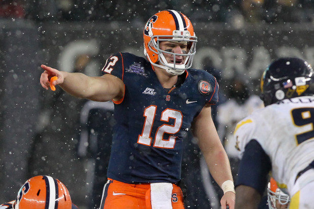
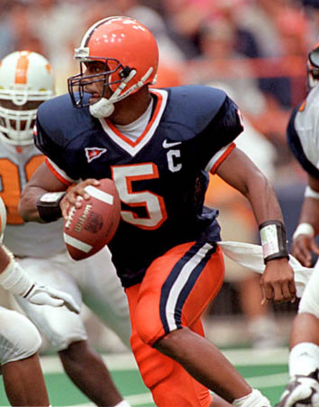
The block S is so generic. Get rid of that. Do we have that big of an identity problem that we need to hit people over the head that the Orange Helmet sans S may/may not be Syracuse? McNabb uniforms are by far the best (or any variation of such from 1990-1998). I didn't like when they went sans names in 1994 though.
Melancer46
Living Legend
- Joined
- Dec 1, 2011
- Messages
- 10,480
- Like
- 13,743
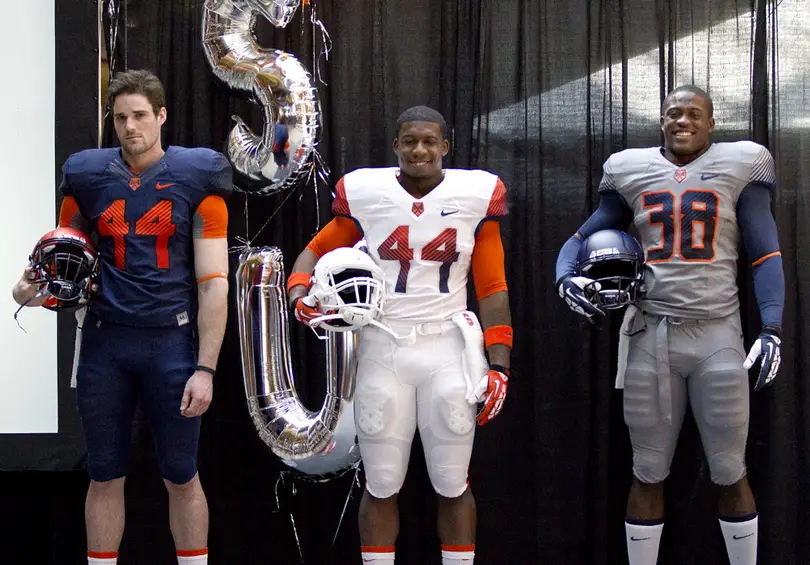
Personally, I think our new white ones are sharp. Still have no idea why we don't have an orange top though. I think an orange top with the white helmet and pants would look really nice. And I'll never understand the gray.
RF2044
Living Legend
- Joined
- Aug 15, 2011
- Messages
- 30,906
- Like
- 100,207
Personally, I think our new white ones are sharp. Still have no idea why we don't have an orange top though. I think an orange top with the white helmet and pants would look really nice. And I'll never understand the gray.
Personally, I like the McNabb era unis the best. But college football has changed, and teams don't have uniforms that generic anymore. Would love to see us go back to that general look. Like Melancer, I liked the Nassib unis, but could do without the block "S."
I also liked the all whites, but also liked the grey ones we used against Notre Dame. We had blue stripes on the pants; if those were orange, those gray uniforms would have been my second favorite behind the McNabb eras.
elimunelson
Solvay Fanatic
- Joined
- Aug 27, 2011
- Messages
- 6,305
- Like
- 12,777
Personally, I like the McNabb era unis the best. But college football has changed, and teams don't have uniforms that generic anymore. Would love to see us go back to that general look. Like Melancer, I liked the Nassib unis, but could do without the block "S."
I also liked the all whites, but also liked the grey ones we used against Notre Dame. We had blue stripes on the pants; if those were orange, those gray uniforms would have been my second favorite behind the McNabb eras.
isn't ND, Penn St, Alabama, USC, Michigan all "generic" in their uniforms? Those are the guys I want to hang with in terms of uniform consistency vs the chasing fashionistas like Oregon and Miami who are known as schools that mix it up with their gear. Even BC has gone back to a traditional look (or the look of success from the 90s). I fail to see how this does us a disservice. I know this is a dead horse topic but it bothers me no end that we're constantly trying to fix something that didn't originally need to be fixed.
Hopefully when Gross is gone the new AD will see my side of the street here. Tradition and consistency matter especially with the team trying to land recruits with the "family" theme.
RF2044
Living Legend
- Joined
- Aug 15, 2011
- Messages
- 30,906
- Like
- 100,207
isn't ND, Penn St, Alabama, USC, Michigan all "generic" in their uniforms? Those are the guys I want to hang with in terms of uniform consistency vs the chasing fashionistas like Oregon and Miami who are known as schools that mix it up with their gear. Even BC has gone back to a traditional look (or the look of success from the 90s). I fail to see how this does us a disservice. I know this is a dead horse topic but it bothers me no end that we're constantly trying to fix something that didn't originally need to be fixed.
Hopefully when Gross is gone the new AD will see my side of the street here. Tradition and consistency matter especially with the team trying to land recruits with the "family" theme.
Those schools are atop the most premier college football brands. We are not. Teams that aren't value sizzle / flash over tradition. :noidea:
Our biggest problem is the association with Nike, and the crappy options they give us.
elimunelson
Solvay Fanatic
- Joined
- Aug 27, 2011
- Messages
- 6,305
- Like
- 12,777
Those schools are atop the most premier college football brands. We are not. Teams that aren't value sizzle / flash over tradition. :noidea:
Our biggest problem is the association with Nike, and the crappy options they give us.
that's a fleeting thing though. Penn St, two years ago, was as down as possible. They didn't decide to go with zany helmets. We were, when I was at Syracuse in the early/mid 90s, a premier program. We're at best mediocre right now but that doesn't mean we can't re-establish our branding with a traditional look.
We can't bend over for Nike anymore.
Rocco
Watching you.
- Joined
- Aug 15, 2011
- Messages
- 11,974
- Like
- 26,081
I'd love to see a modern fit of this exact color scheme. Simple, classy, non-pretentious.

I agree completely. Give this a warrior fit and it would be perfect IMO.
Bayside44
Moderator
- Joined
- Aug 26, 2011
- Messages
- 15,635
- Like
- 32,272
I'd love to see a modern fit of this exact color scheme. Simple, classy, non-pretentious.

That's basically our lax uniform. Give us that in all sports, please!
cuseincincy
All Conference
- Joined
- Aug 26, 2011
- Messages
- 3,619
- Like
- 6,505
I agree with your favorite. I like the block "S". Without the S the helmet looks too much like the Browns helmet:

My 2nd favorite would be the orange pant white jersey that Eric posted though I'd add the block "S" to the helmet for the same reason.
What I really really hate is any uniform where they neglect to outline or shadow the names/numbers. Just looks stupid.
My 2nd favorite would be the orange pant white jersey that Eric posted though I'd add the block "S" to the helmet for the same reason.
What I really really hate is any uniform where they neglect to outline or shadow the names/numbers. Just looks stupid.
i like the 1960's look home jersey white with orange pants would also like numbers on side of helmetI'd love to see a modern fit of this exact color scheme. Simple, classy, non-pretentious.

OrangeXtreme
The Mayor of Dewitt
- Joined
- Aug 15, 2011
- Messages
- 227,426
- Like
- 407,559
I'd love to see a modern fit of this exact color scheme. Simple, classy, non-pretentious.

I always liked the blue numbers.
FAL
No comment.
- Joined
- Jun 5, 2012
- Messages
- 19,610
- Like
- 43,438
Personally, I think our new white ones are sharp. NO. Still have no idea why we don't have an orange top though. I think an orange top with the white helmet and pants would look really nice. NO. And I'll never understand the gray. YES.
RF2044
Living Legend
- Joined
- Aug 15, 2011
- Messages
- 30,906
- Like
- 100,207
that's a fleeting thing though. Penn St, two years ago, was as down as possible. They didn't decide to go with zany helmets. We were, when I was at Syracuse in the early/mid 90s, a premier program. We're at best mediocre right now but that doesn't mean we can't re-establish our branding with a traditional look.
We can't bend over for Nike anymore.
Here's the problem--we had a sustained run of excellence that lasted about 12 years, from 87 - 98, and then the 01 season [which is more of an aberation than norm, given what's transpired since]. You and I know that SU has a proud tradition, and we can sell [at least to a certain extent] the association with Jim Brown, Ernie Davis, the Heisman, the Express, etc.
But kids today don't resonate with our '59 championship. Many of them don't have a clue who Jim Brown is, and even if they do they likely don't know Little / Mackey / Morris / etc. Even Donovan McNabb is out of the league, and not garnering attention for the program anymore. Freeney / Harrison are distant memories for today's recruits.
Couple that with the undeniable fact that we've basically stunk for the decade + since 2001, and we are generally an afterthought for most fans / media types focused on college football. Things really declined under P, as a function of poor recruiting. Then, GRob came in and our program became arguably the worse P5 conference team. We're still digging ourselves out of that mess.
Also need to factor in an AD who has clearly done some good, but also seems to struggle with doing many things right. He is all about show--which is why constant uniform tweaks is perceived by the AD as a good thing.
Believe me, if you went back over the years, you'd see dozens of posts by me expressing the same thing I posted in my original note in this thread: my appreciation for the McNabb era jerseys as the best ever in program history [feel free to validate that with fellow posters who also have repeatedly expressed the same sentiment, Sutomcat and Marsh]. I just recognize that when the program is down, our AD does some squirrely things to try to drum up publicity and fan excitement. My take is that uniforms might excite recruits / players [emphasis on "might"], but the only thing that is going to excite the fanbase is consistent winning.
Personally, I'd love it if we went back to a more "traditional" look and cut it out with the constant changes, weird colors, and gradient shading on helmets / numbers.
Last edited:
OrangeXtreme
The Mayor of Dewitt
- Joined
- Aug 15, 2011
- Messages
- 227,426
- Like
- 407,559
I think an orange top with the white helmet and pants would look really nice.
Bad Frank Maloney flashbacks.

MSOrange
2020 Cali Award Winner, Regular Season Record
- Joined
- Aug 27, 2011
- Messages
- 50,688
- Like
- 124,341
Personally, I like the McNabb era unis the best. But college football has changed, and teams don't have uniforms that generic anymore. Would love to see us go back to that general look. Like Melancer, I liked the Nassib unis, but could do without the block "S."
I also liked the all whites, but also liked the grey ones we used against Notre Dame. We had blue stripes on the pants; if those were orange, those gray uniforms would have been my second favorite behind the McNabb eras.
It's rare I disagree with you. but the grays did nothing for me at all. Maybe the look wasn't bad but I just couldn't figure out how gray suddenly became one of our team colors. I know I know...
Full_Rebar
All American
- Joined
- Jul 10, 2013
- Messages
- 4,073
- Like
- 4,213
These are the ones we need.
View attachment 37617
These are basically the up to date McNabb era uniforms that everyone likes. We never should have moved off these. The McNabb ones with all the stripes are too outdated.
Agree and I'd be fine with an alternate look (all-whites/all-grey/orange jersey and chrome helmet) that was used from time to time.
ImperialOrange
Living Legend
- Joined
- Aug 26, 2011
- Messages
- 18,384
- Like
- 39,563
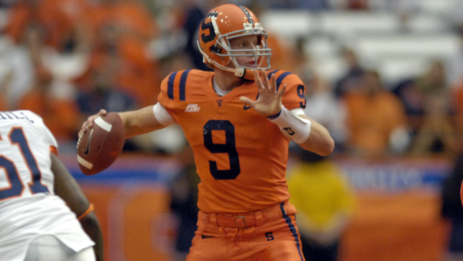
Loved these
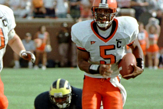
Not these

and REALLY not these
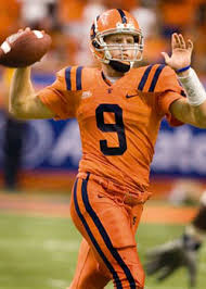
I hated all the uni's with the generic LSU/Va Tech shoulder stripes

Not these

and REALLY not these
I hated all the uni's with the generic LSU/Va Tech shoulder stripes
MSOrange
2020 Cali Award Winner, Regular Season Record
- Joined
- Aug 27, 2011
- Messages
- 50,688
- Like
- 124,341
sssssssssssss
I didn't like the shoulder stripes at the time but they don't look too bad now compared to last year.
Loved these

Not these

and REALLY not these

I hated all the uni's with the generic LSU/Va Tech shoulder stripes
I didn't like the shoulder stripes at the time but they don't look too bad now compared to last year.
ImperialOrange
Living Legend
- Joined
- Aug 26, 2011
- Messages
- 18,384
- Like
- 39,563
sssssssssssss
I didn't like the shoulder stripes at the time but they don't look too bad now compared to last year.
I preferred last years. At least they were unique
Similar threads
- Replies
- 0
- Views
- 389
- Replies
- 0
- Views
- 171
- Replies
- 0
- Views
- 256
- Replies
- 0
- Views
- 328
- Replies
- 0
- Views
- 284

