
You are using an out of date browser. It may not display this or other websites correctly.
You should upgrade or use an alternative browser.
You should upgrade or use an alternative browser.
Mascot: Time for a change?
- Thread starter suinaustin
- Start date
suinaustin
Walk On
- Joined
- Dec 8, 2012
- Messages
- 189
- Like
- 188
I can see the point on many of your comments. I guess I'm part of the old guard. Except for the goat. Never knew that one.
HarrisonJBounel
All Conference
- Joined
- Dec 29, 2011
- Messages
- 3,204
- Like
- 2,216
Syracuse Greyhounds. Blends in with the weather and our Nike color scheme.
And it's the way we travel to away games? Not sure that will help recruiting.
[Edit note: Right after posting this, I started getting Greyhound Bus ads on the side.]
Last edited:
HarrisonJBounel
All Conference
- Joined
- Dec 29, 2011
- Messages
- 3,204
- Like
- 2,216
HarrisonJBounel
All Conference
- Joined
- Dec 29, 2011
- Messages
- 3,204
- Like
- 2,216
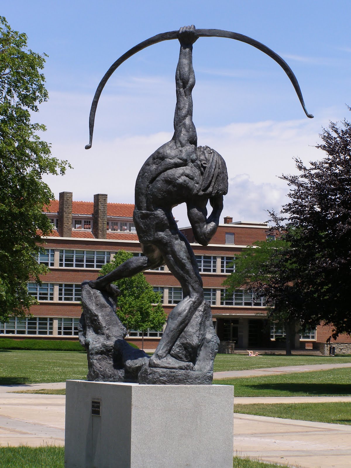
Saltine Warrior.
Leave Otto for the kids.
Uh-oh. Sign of the End Times. We agree on something.
HarrisonJBounel
All Conference
- Joined
- Dec 29, 2011
- Messages
- 3,204
- Like
- 2,216
Or we could go full sellout and use whatever mascot Nike tells us to.
Surprise us, Phil!
Surprise us, Phil!
HarrisonJBounel
All Conference
- Joined
- Dec 29, 2011
- Messages
- 3,204
- Like
- 2,216
That is just awful. I have our new mascot right here. It would be orange of course (or platinum). Would look great on the helmets.

It would be a perfect match for our hideously ugly numbers.
HarrisonJBounel
All Conference
- Joined
- Dec 29, 2011
- Messages
- 3,204
- Like
- 2,216
A thousand points for your avatar.
LPOrange
2nd String
- Joined
- Sep 18, 2011
- Messages
- 509
- Like
- 681
The university did some market research and I was a part of it and they wanted the Orange Pride with a lion mascot or Orange Pack a wolf for the mascot and SU wanted opinions on them. Orange Pack was similar to NC ST but they liked it cause the Orange Pack already existedDidnt they try to do this during the early 90's. Thought the PS came out with some suggestions or something.
Scooch
Living Legend
- Joined
- Aug 27, 2011
- Messages
- 16,288
- Like
- 52,990
The university did some market research and I was a part of it and they wanted the Orange Pride with a lion mascot or Orange Pack a wolf for the mascot and SU wanted opinions on them. Orange Pack was similar to NC ST but they liked it cause the Orange Pack already existed
Correct. And when word got out about that there was a massive "Save Otto" campaign. Most people, like myself, didn't realize that Otto was never formally enshrined as the official mascot of SU. So as the outcry grew Chancellor Shaw announced that Otto would be made the official mascot.
Then the school tried to update the Otto representation and had a contest to choose the new "logo". There were 3 variations of meaner looking Ottos, but the dopey version won.
During the Gross era the school quietly introduced a mean Otto version and has increasingly made that the more frequently used representation.
All of this goes back to how unsavy the school was about this sort of thing in the 70s and 80s. Granted, it was a different era, but I am still dumbstruck that when the school retired the Saltine Warrior it didn't have a formal replacement ready to go. As others said, apparently they "tried" the gladiator style mascot and abandoned it. In this day and age there would have been no "try", a replacement would be chosen and stuck with. Otto exsits because we had NO mascot, so the cheer squad made one up. In a way that's kind of cool, it's organic, not market-tested and focus-grouped. But it's still bizarre that the school punted on choosing a replacement.
The same thing applies to logos. We went through years of never having an official athletics logo. Hell, we used the freakin' SU seal in the 80s. Then we used the bank logo S, the hoops-only stylized S, then the weird SU-over-Dome, then the horrible SJ, before finally establishing the block S.


Mascots and logos have been a comedy of errors for this school for years and years.
Attachments


They should redesign Otto's costume. Make it bigger so you don't see Otto's legs and it's more like an orange. Engineer the frame so Otto can put his feet and head inside the costume and he can be rolled down the court or field by the cheerleaders. Might be a little dizzying but nothing a college student couldn't handle.
Eric15
Living Legend
- Joined
- Aug 28, 2011
- Messages
- 29,312
- Like
- 108,696
Correct. And when word got out about that there was a massive "Save Otto" campaign. Most people, like myself, didn't realize that Otto was never formally enshrined as the official mascot of SU. So as the outcry grew Chancellor Shaw announced that Otto would be made the official mascot.
Then the school tried to update the Otto representation and had a contest to choose the new "logo". There were 3 variations of meaner looking Ottos, but the dopey version won.
During the Gross era the school quietly introduced a mean Otto version and has increasingly made that the more frequently used representation.
All of this goes back to how unsavy the school was about this sort of thing in the 70s and 80s. Granted, it was a different era, but I am still dumbstruck that when the school retired the Saltine Warrior it didn't have a formal replacement ready to go. As others said, apparently they "tried" the gladiator style mascot and abandoned it. In this day and age there would have been no "try", a replacement would be chosen and stuck with. Otto exsits because we had NO mascot, so the cheer squad made one up. In a way that's kind of cool, it's organic, not market-tested and focus-grouped. But it's still bizarre that the school punted on choosing a replacement.
The same thing applies to logos. We went through years of never having an official athletics logo. Hell, we used the freakin' SU seal in the 80s. Then we used the bank logo S, the hoops-only stylized S, then the weird SU-over-Dome, then the horrible SJ, before finally establishing the block S.
Mascots and logos have been a comedy of errors for this school for years and years.
I always loved that first one on the left.
Eric15
Living Legend
- Joined
- Aug 28, 2011
- Messages
- 29,312
- Like
- 108,696
If this isn't sarcasm, you might be the only one.
I just nostalgically associate that logo with late 80s CBS matchups with Georgetown, etc.
Scooch
Living Legend
- Joined
- Aug 27, 2011
- Messages
- 16,288
- Like
- 52,990
I just nostalgically associate that logo with late 80s CBS matchups with Georgetown, etc.
Who doesn't love negative space!
The block S is fine and historic, but my favorite is the elongated S. I really wish they made that with just an orange circle rather than a basketball and used it as the primary athletics logo. Very distinctive.
orangefan13
Hall of Fame
- Joined
- Aug 31, 2011
- Messages
- 8,081
- Like
- 5,211

Ringostar57
All Conference
- Joined
- Jan 25, 2015
- Messages
- 2,165
- Like
- 2,564
An orange named Otto? Why Otto. Too bad there is an Orange Julius. How about Orange Carmelo?
HoustonCuse
2020-21 Iggy Winner Lead Scorer & Post Season Rcd
- Joined
- Aug 16, 2011
- Messages
- 11,299
- Like
- 25,224
I always loved that first one on the left.
Ah yes the old Tidy Bowl logo. Who doesn't love that one?
Ugh.
Janner
Starter
- Joined
- Aug 29, 2011
- Messages
- 1,426
- Like
- 3,571
I'd almost go in the opposite direction, have one game a year where they bring out all the old OTTO suits and have as many OTTO's running around as possible. I would love to see the slight changes in design and concepts over the years.
Similar threads

- Replies
- 60
- Views
- 4K
- Replies
- 6
- Views
- 802
- Replies
- 0
- Views
- 305
- Replies
- 5
- Views
- 470