
Orange87
2nd String
- Joined
- Oct 5, 2011
- Messages
- 638
- Like
- 886
Amidst all of the opinions flying around regarding these new controversal uniforms I had yet to see a picture of the back with both numbers and names...
Now that I have, I change my vote from 'Eh' to 'STRONGLY DISLIKE'.
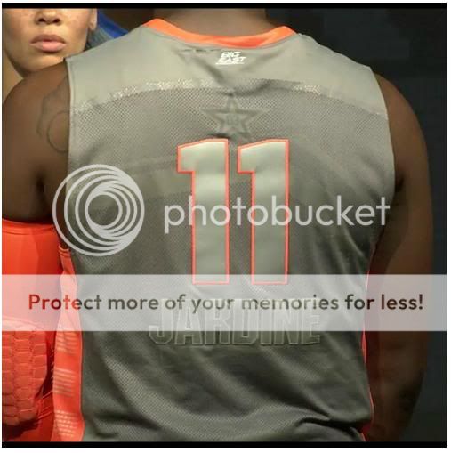
Name below number? Sorry, not a fan.
Now that I have, I change my vote from 'Eh' to 'STRONGLY DISLIKE'.
Name below number? Sorry, not a fan.