I hate the "if you're old, you don't like change" comments. It's not black and white like that. Do some younger folk like these? Sure. But if these new unis were actually really good, you'd see some recruits not associated with SU commenting on them.
As someone who works with typography every day, the numbers are just HOT GARBAGE. There is no way those will look cool to 99% of people once the novelty wears off.
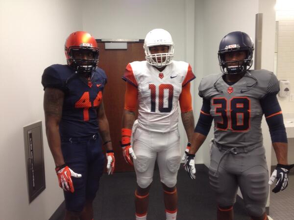
And I agree on the What where are the orange versions? We've already been disappointed with the "they'll reveal them at the [insert team] game!" stories. Just show us the damn things.
The hatchet 44 logo is actually looking pretty cool to me now. Maybe not implemented in the best way, though.


 Adonis Jennings @ADED_2