
You are using an out of date browser. It may not display this or other websites correctly.
You should upgrade or use an alternative browser.
You should upgrade or use an alternative browser.
OT: Some New Uniforms of 2013
- Thread starter anomander
- Start date


MassOrange
Walk On
- Joined
- Aug 26, 2011
- Messages
- 183
- Like
- 171
The Hokies camo looks like someone yakked on the helmet.
Kansas really needs 5 helmets? Sinister Black + Woody Woodpecker?
Just say no.
Kansas really needs 5 helmets? Sinister Black + Woody Woodpecker?
Just say no.
We aren't wearing new jerseys because the HCs DM and now SS don't care about it. I don't want Oregon or Maryland like changes but adding an Orange home jersey into the rotation, and white pants, blue pants, and maybe different Orange helmets. This won't happen so we are all beating a dead horse.
Jeepers
Starter
- Joined
- Aug 27, 2011
- Messages
- 1,876
- Like
- 1,319
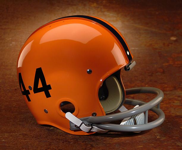
I'd just really like to see that chrome orange helmet (that wasn't actually for SU) be used with something. Pretty sharp--and I don't even really like the chrome/matte trend.
I've come to realize that helmet design has changed (out of necessity?) since they've gone to the vented anti-concussion shape. Some things that looked great on the rounded helmets, just don't look the same with the vents. I think that's why the Navy helmet looks so good. It's kind of designed around the vents.
Still much prefer the old rounded helmets. And I wonder if the anti-concussion thing is just marketing BS. What is so special about them that they couldn't put the technology inside the standard round helmet?
Rocco
Watching you.
- Joined
- Aug 15, 2011
- Messages
- 11,960
- Like
- 26,030
Those Rutger's stRong helmets are hilariously bad. As well as Seaside on the backs. Way to try to be Jersey Shore's football team.
Here is this year's starting offensive line:

They all want to be centers... nothing like a guy behind you while bent over.
Here is this year's starting offensive line:
They all want to be centers... nothing like a guy behind you while bent over.
IHeartSUFball
All Conference
- Joined
- Aug 16, 2011
- Messages
- 2,017
- Like
- 779
surprised you say shafer doesnt want new unis..seems like a guy that would do anything to get the players what they want
PeteCalvin
Hall of Fame
- Joined
- Aug 26, 2011
- Messages
- 8,551
- Like
- 10,733
Those Rutger's stRong helmets are hilariously bad. As well as Seaside on the backs. Way to try to be Jersey Shore's football team.
Here is this year's starting offensive line:
They all want to be centers... nothing like a guy behind you while bent over.
Wasn't that picture made into one of those Un-inspirational posters? I could have sworn it had the word "douchebags" underneath it.
NailstheCusefan12
All American
- Joined
- Aug 29, 2011
- Messages
- 4,126
- Like
- 5,869
I love the ASU helmets (except for the yellow one). Big fan of that color scheme to begin with and that pitchfork logo is cool.
OrangeBlood
Starter
- Joined
- Oct 25, 2011
- Messages
- 1,333
- Like
- 1,055
I just wish the orange on our jerseys and our pants matched the shade of orange on our helmets. In person and HD TV you can notice that helmets are a more dull shade.
It's a pet peeve of mine, I don't know.
It's a pet peeve of mine, I don't know.
Similar threads

- Replies
- 34
- Views
- 2K
- Replies
- 6
- Views
- 402
- Replies
- 92
- Views
- 4K