All Whites Today | Page 2 | Syracusefan.com

All Whites Today

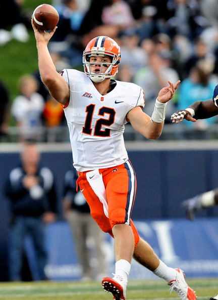
I agree winning is more important, but why can't we have both? Win looking like the Syracuse Orangeman.

Did we really think we were going to change uniforms mid-season? Are you surprised this is what we are wearing today? I think it's been well established we aren't wearing the orange this year.
 
You mean something like this?

-25ba026ec18e8314-custom-665xautojpg-4e5bcbfb1766ede8_large.jpg
Well now that you mention it...
 
anomander said:
Did we really think we were going to change uniforms mid-season? Are you surprised this is what we are wearing today? I think it's been well established we aren't wearing the orange this year.

Why not. After seeing the abomination that are our uni's, you really buy the story we can't order and get orange pants till next year?
 
Not at all. I think it's pretty stupid. They should have made sure to have the orange set the first year.
Yes, they should have. But to assume you can't order something until next season...
 
I think the helmet looks like it is unpainted with an orange S decal on it. That being said, I don't care, just win baby.
 
maybe the budget wont allow football program to order anything until next year after getting multiple new uni's this year?
 
Rocco said:
White, blue, grey, orange, purple... who gives a damn? Let's just win a fecking football game.

Is there a purple combo?
 
I could solve the budget issue...take Giansante's salary and use that money to get orange uniforms. Two problems solved.

Maybe FedEx is to blame since Oregon St, Illinois and Miami all received their full compliment of Nike combinations in time for this season.
 
Like others have said, I'd love to see more orange in the uni combinations. Oregon St and Illini look sharp.

What bothers me the most, however, is the fugly number font that desperately needs to be outlined.

Yeah, along with those foolish candy stripes in the numerals... :bang:
 
I'm completely the opposite. I think the removal of the outline on both helmets (white on the orange, blue on the white) is a huge downgrade. Makes it look second rate and cheap in my opinion.

What is really weird is how all three helmets had the outline at the unveiling, and the Orange helmet had it the first game and that was it. Like it or not, why the lack of consistency?

Couldn't agree more...for me, it's similar to having jersey numerals without the piping...
 
We look cheap. It really has nothing to do w winning but it represents the university. I'd prefer to win and look good.
 
1. I don't like the elongated numerals, the 44 degree stripes are fine.
2. Don't like the Gray Uni at all.
3. Love the white Uni, when worn with Orange shirt, socks, arm sleeve etc.
4. Blue uni is OK. Orange chrome helmet Rocks.
5. Where are the G.D. Orange Jersey and pants?
6. Last but not least, Still love the traditional uniform.
 

Forum statistics

Threads
167,788
Messages
4,727,199
Members
5,920
Latest member
CoachDiddi

Online statistics

Members online
173
Guests online
2,336
Total visitors
2,509


Top Bottom