
You are using an out of date browser. It may not display this or other websites correctly.
You should upgrade or use an alternative browser.
You should upgrade or use an alternative browser.
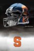
Illinois gets new helmets
- Thread starter SU2NASA
- Start date
Texas Otto
2nd String
- Joined
- Dec 11, 2012
- Messages
- 781
- Like
- 351
Hmmmm
Texas Otto
2nd String
- Joined
- Dec 11, 2012
- Messages
- 781
- Like
- 351
CaliCuse
All American
- Joined
- Aug 26, 2011
- Messages
- 7,207
- Like
- 2,164
I feel like they're somewhat familiar...

CaliCuse
All American
- Joined
- Aug 26, 2011
- Messages
- 7,207
- Like
- 2,164
You is? Be proud and say ahh.Idaho ?
Texas Otto
2nd String
- Joined
- Dec 11, 2012
- Messages
- 781
- Like
- 351
No You da hoeYou is? Be proud and say ahh.

ImperialOrange
Living Legend
- Joined
- Aug 26, 2011
- Messages
- 18,339
- Like
- 39,424
I feel like they're somewhat familiar...
Love the blue face masks... I only we had those :bang:Oh Lord
BlazeOrange
Starter
- Joined
- Aug 28, 2011
- Messages
- 1,925
- Like
- 1,865
Putting the players number on the helmets in roman numerals is innovative. Not sure how practical its going to be for some of the linemen numbers and others though.
bnoro
Lurker
- Joined
- Aug 15, 2011
- Messages
- 11,267
- Like
- 32,638
i might not root for us anymore if we wore that. atrocious. even though it's fan createdI like this helmet for the Cuse...
OrangePA
Living Legend
- Joined
- Aug 24, 2011
- Messages
- 10,013
- Like
- 15,035
i might not root for us anymore if we wore that. atrocious. even though it's fan created
Agreed.
Eliminating the Orange helmets would be like ND eliminating the gold helmets.
Our uniform is one of the sharpest in the USA - especially the away whites.
Don't mess things up - in the way we did during the Robinson years.
NineOneSeven
2018-19 Iggy Hoops Leader Scorer
- Joined
- Aug 30, 2011
- Messages
- 41,022
- Like
- 71,536
Agreed.
Eliminating the Orange helmets would be like ND eliminating the gold helmets.
Our uniform is one of the sharpest in the USA - especially the away whites.
Don't mess things up - in the way we did during the Robinson years.
The all orange unis?
SU2NASA
All American
- Joined
- Aug 29, 2011
- Messages
- 6,937
- Like
- 8,472
OrangePA
Living Legend
- Joined
- Aug 24, 2011
- Messages
- 10,013
- Like
- 15,035
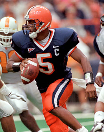
No, these were.
Yes. You're right.
I would prefer the helmets without the "S" and I would like to see the player number on the side of the pants.
No argument from me.
OrangePA
Living Legend
- Joined
- Aug 24, 2011
- Messages
- 10,013
- Like
- 15,035
The all orange unis?
All of the versions that were used.
The white pants and blue jerseys.
The blue jerseys and orange numbers.
The all orange look.
The all white look.
They were all fugly.
DoctorBombay
Hall of Fame
- Joined
- Aug 27, 2011
- Messages
- 9,613
- Like
- 26,832
i might not root for us anymore if we wore that. atrocious. even though it's fan created
SaltineWar
Scout Team
- Joined
- Sep 15, 2012
- Messages
- 438
- Like
- 336
No, these were.
These are downright sexy. The difficult/possibly dangerous old turf in this pic was better too.
TheCusian
Living Legend
- Joined
- Sep 24, 2012
- Messages
- 22,755
- Like
- 33,582
No, these were.
2nd Best. I like our current uni's better. Even the block "S."
Don't care for the orange drop shadow on the "5" and the thick bands around the neck date it. I could be sold on a combo of the 2.
SaltineWar
Scout Team
- Joined
- Sep 15, 2012
- Messages
- 438
- Like
- 336
2nd Best. I like our current uni's better. Even the block "S."
Don't care for the orange drop shadow on the "5" and the thick bands around the neck date it. I could be sold on a combo of the 2.
Really I'd be fine if they just dropped the block S from the helmet, but I'd be ecstatic if they also got rid of the stupid piping. Otherwise the current unis are decent. A huge improvement over the Grob years.
OttoMets
Living Legend
- Joined
- Aug 28, 2011
- Messages
- 20,846
- Like
- 39,728
2nd Best. I like our current uni's better. Even the block "S."
Don't care for the orange drop shadow on the "5" and the thick bands around the neck date it. I could be sold on a combo of the 2.
Have waited for someone to point this out. The drop shadow is so bad - very early-'90s (we stole it from the 49ers in McNabb's sophomore year). It's funny that those remain so popular. Must be associated with winning.
Our current ones are classic; hard to argue for a change.
OrangePA
Living Legend
- Joined
- Aug 24, 2011
- Messages
- 10,013
- Like
- 15,035
Really I'd be fine if they just dropped the block S from the helmet, but I'd be ecstatic if they also got rid of the stupid piping. Otherwise the current unis are decent. A huge improvement over the Grob years.
I agree - drop the block "S" on the helmet.
Watched a replay of the NC State - Miami game last night.
I couldn't help but notice the block "S" on the NC State helmets. I thought of the same block "S" on the Stanford helmets.
No block "S" on our helmets would be truly unique.
money3189
Living Legend
- Joined
- Aug 26, 2011
- Messages
- 10,199
- Like
- 41,107
I say meet old school and new school half way. Have the block S on one side and nothing on the other, In addition to that I will prefer to go back to the blue cages. Make the jersey more tapered to the body and sleeve area, get rid of the piping on the jersey.
Similar threads

- Replies
- 4
- Views
- 641