Millhouse
Living Legend
- Joined
- Aug 16, 2011
- Messages
- 29,203
- Like
- 34,377
that is the best uniform of the bunch
that is the best uniform of the bunch
Problem is 10th Mountain Division are two swords, not battle axes.
not until they make it look better than a 6 year old birthday party!
Love the change, the uniforms the announcement and anything that gives me a Syracuse football rush like today did. Once again these jerseys r what the players want and that's what matters.

Agreed!! We had some of the most attractive uniforms in all of college football and now we have these glitzed up disco versions that just look corny. No other way to describe it. Virtually ignoring that they are the orange and making the home uniforms all blue. It's just ridiculous actually. I get the sense that the kids are controlling everything. They want to get paid and decide what uniforms they wear. This should be about what the paying customer likes not what the kids like. Kids like a lot of things are just foolish. IMO the sport is going to far but what do I know know.
Problem is 10th Mountain Division are two swords, not battle axes.
That's for all the Heisman Trophys we won't be winning.
So Im sorry you wanted them to actually use the military insignia? Do you have any idea how disrespectful that is?
They're trying to say the numbers are long (hideous) because they're supposed to be skyscrapers (dumb).
I don't think it's disrespectful. I think it would be an honor to have the 10th mnt patch on our jerseys. Based on our relationship with Drum? I think it would be great.
I know it's West Point, but they rock division patches.
Being a fashion designer must give you access to the good stuff, especially in Oregon:
I like the nod to Fort Drum and NYS as a whole.
- The stripping is at 44 degrees? Who the f would ever figure that out
- The numbers are tall and skinny to resemble the NYC skyline? C'mon give us a real answer.
I don't care for the shoulders or the numbering. Gray is quite like WFVU, White has a Texas look from the front, and I don't care for all blue. ORANGE!
I'm all for having multiple options "to keep it fresh" but man simpler is better and I wish all the extra whiz-bangish details.
I am going to hold off final judgement though until the season starts and the non-prototype jersey's are worn (hopefully) and I see them in person. Maybe they will tweak them over the next couple months.
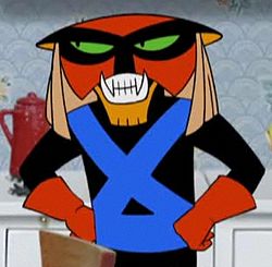
Hide the onions!the axes that are supposed to make people think of fort drum if anyone knew what fort drum was and anyone connected axes with fort drum... anyway that logo looks like brak


