"Major Announcement" tomorrow | Page 23 | Syracusefan.com

"Major Announcement" tomorrow

Its disrespectful - we are not in their unit. You wouldnt get a semper fi tatoo would you?

lol of course not. You're prolly right, I'm prolly not thinking it all the way through. The 10th MNT patch was the only patch I wanted to wear when I joined, and I'm proud to have worn it on both my left, and my right shoulder.
 
So Im sorry you wanted them to actually use the military insignia? Do you have any idea how disrespectful that is?

I think it's more disrespectful to make a fake emblem using upside down and backwards 4's and say it's symbolic of the 10th Mountain Division.

They look cool though. :noidea:
 
lol of course not. You're prolly right, I'm prolly not thinking it all the way through. The 10th MNT patch was the only patch I wanted to wear when I joined, and I'm proud to have worn it on both my left, and my right shoulder.

See you can wear it. I cant. And you punch me in the face for doing so...:)
 
How many kiosks are there? Be great if they could strategically place them all over the city... Lets put on in Union Station in NYC too... What the heck! :)

Where exactly is Union Station in the City?
 
Hey look! The striping is at 44 degrees! Wow! Check it out - the NYC skyline!

It's like the crap they put on the basketball uniforms to recognize the campus, etc. Like anyone notices that stuff.
 
I think it's more disrespectful to make a fake emblem using upside down and backwards 4's and say it's symbolic of the 10th Mountain Division.

They look cool though. :noidea:

They didnt say that. He said it symbolic of interlocking arms and the military uses similar signs.
 
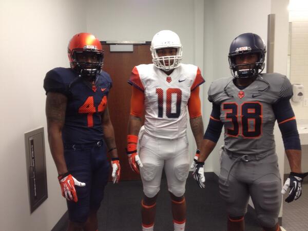
Let's face it the look and the rational behind the look is somewhat immature and cartoonish. It sounds like they hired some highschool kids to come up with a concept and create a look. To me it's pretty simple just make the damn things look good. Forget about skyscrapers and 44 degree angles. Create a good product and try to stay with tradition to some degree. The concept doesn't even make sense.
 
Pretty cool, SU.

BlXos2qCEAA7sWB.jpg
 
for uniforms not mattering much it's pretty impressive there is a 13k+ view 557 post threat in less then 12 hours

well, to be honest.. we didnt know that this was about uniforms for the first 6 or 7 hours
 
Let's face it the look and the rational behind the look is somewhat immature and cartoonish. It sounds like they hired some highschool kids to come up with a concept and create a look. To me it's pretty simple just make the damn things look good. Forget about skyscrapers and 44 degree angles. Create a good product and try to stay with tradition to some degree. The concept doesn't even make sense.

You dont like them, but I do. The concept is new jerseys, in a new era, with kids younger than you that like them. Cant please everyone.
 
The uniforms look small-time. Very Conference USA.
Yes, I agree. The first thing that strikes me is the general shoddiness. The materials, the stitching, the design, the way the colors on different pieces of apparel don't match, the cheap looking fonts used for numbers and letters that look like they were hand drawn by children.

Heck the colors they use don't even go together. Everything about them screams cheap garbage.

Lastly, they refuse to acknowledge that the primary color of Syracuse is orange and on the rare occasions when they do deign to use orange, they use a color that is far closer to red than to Syracuse orange.

What a bunch of hacks.
 
Really not a fan of the unis at all, but I actually like the gray ones the most. And I've been against gray in our color scheme.
 
Yes, I agree. The first thing that strikes me is the general shoddiness. The materials, the stitching, the design, the way the colors on different pieces of apparel don't match, the cheap looking fonts used for numbers and letters that look like they were hand drawn by children.

Heck the colors they use don't even go together. Everything about them screams cheap garbage.

Lastly, they refuse to acknowledge that the primary color of Syracuse is orange and on the rare occasions when they do deign to use orange, they use a color that is far closer to red than to Syracuse orange.

What a bunch of hacks.

So, Tom, I can sense that you like them.

I knew you would.
 
You dont like them, but I do. The concept is new jerseys, in a new era, with kids younger than you that like them. Cant please everyone.

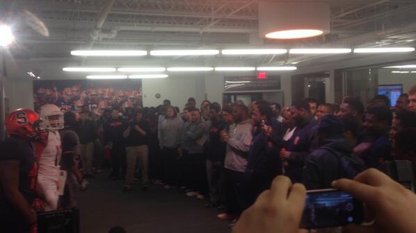
Not exactly a mosh pit when they showed the team...
 
So I went to see how to buy some of these BOGOs... cuse.com is down
 

Forum statistics

Threads
167,702
Messages
4,721,542
Members
5,917
Latest member
FbBarbie

Online statistics

Members online
300
Guests online
1,866
Total visitors
2,166


Top Bottom