JJReddawg
All Conference
- Joined
- Aug 26, 2011
- Messages
- 3,521
- Like
- 7,028
Maybe someone had "lock the doors" trademarked. :noidea:It was "lock the doors". Don't know why it got downgraded to "lock the gates". Oh Lord

Maybe someone had "lock the doors" trademarked. :noidea:It was "lock the doors". Don't know why it got downgraded to "lock the gates". Oh Lord
Not big on the look but whatever. But the color schemes, as we know them right now, suck.
I love the unis...it pays homage to the past (SU) and gives a nod of respect to the soldiers at Ft Drum.
The 44 battle axes to me looks like a guidon flag used in the military...really well done
It means several things to me: 44, battle axes and a guidon. I can see any of those 3 things.

got mine day of spring game at mannysI need that orange shirt. Where did you get it?
Mike...the "44" Battle Axe is just a likeness. No permission needed.TexanMark - what is the protocol for an organization like SU to use any military likeness, like the guidon flag? Is it is simple as a normal request from one org to another? I understand we have the relationship with Fort Drum already, but what does SU (or what SU should do) to get permission for this?
Would they need permission to have a 10th MTN air canon that could fire rolled up shirts all over the Dome at half-time. Operated by a Ft. Drum soldier? Maybe too military for northern liberal yankee school , but it would be fun.Mike...the "44" Battle Axe is just a likeness. No permission needed.
OTOH, SU carrying the 10thMTN flag as they run onto the field definitely needed permission from the military brass. It is a no-brainer for the military though as it is good publicity.
Mike...the "44" Battle Axe is just a likeness. No permission needed.
OTOH, SU carrying the 10thMTN flag as they run onto the field definitely needed permission from the military brass. It is a no-brainer for the military though as it is good publicity.
Nah, the right hand knuckles say "HARD" and the left hand knuckles say "NOSE."Yep. Opted to have it tattooed on Shafer's knuckles instead.
The t-shirts are great- SU Bookstore had them when I stopped in a couple of weeks ago. Might be cheaper at Dick's or somewhere else. I like the various uniform combinations, especially like the all-white look which I think will play well on the road in an afternoon game.
Dislike the numbers- the shape, the stripes which go in opposite directions on each number. Curious to see how the blue unis look on tv as the lack of a contrasting trim around the numbers on the blue ones might make them hard to decipher. I mean my fear is that no tv announcer will be able to tell our players apart and that won't make a great national impression. Wish we had the NCAA Football game to see how they look "live"
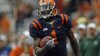
The orange number on blue uni baffles me still (as does the blue numbers on orange jersey whenever we get that). You'd think nike would have remembered those awful GRob uniforms that were so dark and difficult to see in the dome that we had to resort to wearing the whites at home for our last game or two.OrangeAggieArmy said:Yup, orange numbers on the blue jerseys with no white piping is not going to look good on TV. I don't mind the font of the numbers, but should have gone white on blue with orange piping and lose the diagonal stripes. The neck patch pays enough homage to 44.

It definitely requires some getting use to by many but, from the time they were released and the initial shock wore off, it seems that more are accepting the new uniforms (not necessarily in love with them). But probably as mentioned by someone else, it has nothing to do with us. It is a recruiting tool and the players themselves are the only ones who would have to concern themselves with caring and they love it.the crossed axes, the wacky font, the weird lines in the numbers. I dont know that many Su fans outside of this board, but my informal pole of the people i know who go to games is running easily 80% dislike the uniforms. As I said my kids HS team, the kids i have talked too which is about half the team hates them. the kids at college that I have talked too dont like them and most of them are athletes but not fball players for the most part. Then again our school is about as traditional as it gets for uniforms.
I completely agree with you. Their opinion matters most. It's like a comparison between someone buying clothes at JC Pennies vs Express. Sure Pennies gets the job done but it the same crap and doesn't change and hasn't in 50 years and no kid wants to shop there. Express is aimed at the youth and is new and inventive and meant for a shock value. (And yes I just went there lol)That's weird since it seems close to 100% of current players, and recruits seem to love them?
thorpedo said:I completely agree with you. Their opinion matters most. It's like a comparison between someone buying clothes at JC Pennies vs Express. Sure Pennies gets the job done but it the same crap and doesn't change and hasn't in 50 years and no kid wants to shop there. Express is aimed at the youth and is new and inventive and meant for a shock value. (And yes I just went there lol)
The orange number on blue uni baffles me still (as does the blue numbers on orange jersey whenever we get that). You'd think nike would have remembered those awful GRob uniforms that were so dark and difficult to see in the dime that we had to resort to wearing the whites at home for our last game or two.
View attachment 19592
Nah, the right hand knuckles say "HARD" and the left hand knuckles say "NOSE."
Uniform Nation's 2014 ACC uniform rankings
In the past decade or so, Syracuse has had a hard time committing to one look. The Orange added a block "S" to the side of the helmets and slightly modified the jerseys until they had a pretty solid look...until now. The number font alone is enough to put Syracuse at the bottom of this list.
CuseOnly said:I think it is funnier that you put any stock at all in a website named "land grant" and mentions Ohio State. When I think of the Big 10 I think of lumbering boring football and cheaters. Maybe they should rate those things in their own conference instead of another conference's uniforms. They should have their list of most cheating universities in their own conference. I wouldn't lose sleep over one clown website's opinion.
")