
You are using an out of date browser. It may not display this or other websites correctly.
You should upgrade or use an alternative browser.
You should upgrade or use an alternative browser.
Uniforms
- Thread starter anomander
- Start date
Rocco
Watching you.
- Joined
- Aug 15, 2011
- Messages
- 11,926
- Like
- 26,007
We need to pick a home uniform and an away uniform and STICK with it for awhile. With all of this mix and match, half the time I get confused who is who.
The teams need to focus on executing their offense/defense and not as much about the uni's.
The teams need to focus on executing their offense/defense and not as much about the uni's.
- Joined
- Aug 16, 2011
- Messages
- 99,128
- Like
- 203,321
CuseOnly said:Agreed, that was kind of the point. When you hear the same thing over and over and over and over from the same people, it kind of seems pretty extreme to me. It is very much like a 3 year old saying "I want an orange popsicle." over and over and over and over while you are on the phone trying to have a conversation. A few times isn't really extreme, but after hearing it 50 times, it is extreme and excessive. If you are set in your ways, fine. If you really really like the older style of uniforms, that is fine too. Expressing one's opinion is fine as well, especially here because I have some of my own.
You just pointed out why there are so many if these threads and they escalate. My here are many people who like them, there are many that don't. There are some that think they are great, some think they are horrible. Each is an opinion like you say. But when someone expresses their opinion that they don't like them, there are these snarky comments about 3 year olds, you must be over 40, get with the times, old guys, etc. You just made a very reasonable post in your opinion, but compared someone that disagrees with a 3 year old.
SU68
Starter
- Joined
- May 5, 2013
- Messages
- 1,702
- Like
- 2,380
I must have missed it, but where did the 44 axes come from? Is it a takeoff on the 10 MTN Division flag?I don't oppose new uniforms, but I'd love to hear how many casual CFB fans would look at that and say "Oh yeah that's Syracuse". Compared to the re-brand at Miami, I think SU did a poor job of enhancing the brand (with the exception of the 44 axes- those are sweet and should be on all kinds of gear).
The new Miami options might not be universally liked, but when you saw them on Monday you knew who it was right away.
OrangeXtreme
The Mayor of Dewitt
- Joined
- Aug 15, 2011
- Messages
- 258,692
- Like
- 486,411
OttoForLife
2nd String
- Joined
- Aug 16, 2011
- Messages
- 500
- Like
- 391
I'm going to guess Nike has a whole lot of data and insights into what designs are going to meet their needs and the needs of each school. They're a mildly successful little shop. Seriously doubt they are just throwing crap against the wall.
And for the record, I'm all for change with respect to the SU football brand. It's still in the toilet in many respects. The fact that we are in a somewhat small group of schools they are moving in this direction is great.
And for the record, I'm all for change with respect to the SU football brand. It's still in the toilet in many respects. The fact that we are in a somewhat small group of schools they are moving in this direction is great.
OrangeXtreme
The Mayor of Dewitt
- Joined
- Aug 15, 2011
- Messages
- 258,692
- Like
- 486,411
I'm going to guess Nike has a whole lot of data and insights into what designs are going to meet their needs and the needs of each school. They're a mildly successful little shop. Seriously doubt they are just throwing crap against the wall.
They don't?
")

sufandu
Living Legend
- Joined
- Aug 30, 2011
- Messages
- 16,665
- Like
- 27,630
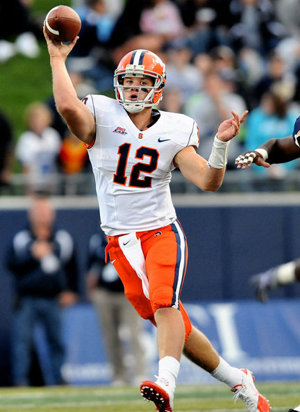
I love the helmets. In the rest of the uniform there's too much blue, and I don't say that simply because our color is orange. I say it because it's a dark color and I think it needs something else to complement it. I would've preferred either the jersey or pants be something other than blue. I also don't like the numbers. To squashed on top and stretched at the bottom. Not a big fan of the diagonal line design of them either.I don't know, but I think these uniforms look pretty damn sweet in this picture right here.

Question for those who don't like the uniforms. Do you dislike them because there isn't enough orange, or is it the design? Because that picture above makes them look pretty good imo.
sufandu
Living Legend
- Joined
- Aug 30, 2011
- Messages
- 16,665
- Like
- 27,630
For me, it's not that it's a single color. It's that it's a really dark single color. That much dark blue is too much. If we're going to have single color uniforms, I prefer something that's brighter.It's ironic that so many people don't like single color football uniforms, but we all (generally) hated that these were two colors.

RobCWhatUp
Walk On
- Joined
- Aug 22, 2011
- Messages
- 106
- Like
- 135
I agree with some of the other posts in the thread. While I would no doubt love an all-Orange look, I thought the Orange popped pretty under the Dome lights (and I didn't have an issue with the numbers from section 302, Row S) and adding a few more accents would really make it pop even more (i.e. orange belt, orange cleats, orange gloves, orange armbands). McNabb stepped on campus 20 years ago. Since then the program became a glorified 1AA school, fought its way back to respectability, had 3 new coaches (not counting P), and moved to a new conference. A forward thinking uniform fits exactly with the forward rise of the program. The uniforms over the last 10 years were generic templates of other uniforms. That doesn't scream Syracuse brand to me. Having a unique, one-of-a-kind, uniform with a story behind certainly does. I'm excited to see the Orange look when it debuts, but I'm even more excited to the white look next weekend just because that's what we are going to get!
I believe the uniforms will grow on people more and more as the season keeps moving. Hopefully, it's because the team is winning and we all know winning cures all")
That being said, to develop the brand even more, I'd love to see the 44 ax used as the helmet logo in the future.
I believe the uniforms will grow on people more and more as the season keeps moving. Hopefully, it's because the team is winning and we all know winning cures all
That being said, to develop the brand even more, I'd love to see the 44 ax used as the helmet logo in the future.
How many people who think the numbers were easy to read were really keeping track of the numbers? And the names were just as hard to read. I know when 6,8,9 were out there I really couldnt tell at first glance who was making plays, catching punts etc. even the font made 3 look 7 from a distance and the reality is most of the crowd is at distance..
Jeepers
Starter
- Joined
- Aug 27, 2011
- Messages
- 1,884
- Like
- 1,328
To most fans (not just SU) basketball uniforms are a solid color, and football are mixed jersey and pants. I'm having trouble thinking of any "traditional" football uniforms, college or NFL, that is a solid color. Besides all whites.
Another thing…anyone who hates old school grey facemasks? I think it's safe to say those are never coming back (one weird traditional thing that I always liked).
Another thing…anyone who hates old school grey facemasks? I think it's safe to say those are never coming back (one weird traditional thing that I always liked).
jekelish
Living Legend
- Joined
- Aug 16, 2011
- Messages
- 22,154
- Like
- 36,685
Agree with this. Orange pants would be great, and the numbers should be outlined in white.Needs orange pants , and the numbers are hard to read from a distance.

jekelish
Living Legend
- Joined
- Aug 16, 2011
- Messages
- 22,154
- Like
- 36,685
I can tell you that the numbers will annoy the people who keep the stats, that's for sure. The weird font paired with the lack of a white outline to really make the numbers pop = unhappy SIDs.How many people who think the numbers were easy to read were really keeping track of the numbers? And the names were just as hard to read. I know when 6,8,9 were out there I really couldnt tell at first glance who was making plays, catching punts etc. even the font made 3 look 7 from a distance and the reality is most of the crowd is at distance..
sufandu
Living Legend
- Joined
- Aug 30, 2011
- Messages
- 16,665
- Like
- 27,630
You know that those weren't McNabb uniforms that he referenced, right? That's Nassib in those pictures.But you can appreciate that the kids we're trying to recruit don't care what McNabb wore, right? And that they want to wear what they consider "hip"?
I'm agnostic to the uniforms -- but exceedingly interested in the mindset of the people who care so much.
OrangePA
Living Legend
- Joined
- Aug 24, 2011
- Messages
- 10,396
- Like
- 16,771
I don't know, but I think these uniforms look pretty damn sweet in this picture right here.
Question for those who don't like the uniforms. Do you dislike them because there isn't enough orange, or is it the design? Because that picture above makes them look pretty good imo.
Orange pants would certainly help a lot.
sufandu
Living Legend
- Joined
- Aug 30, 2011
- Messages
- 16,665
- Like
- 27,630
You're comparing apples to oranges (no pun intended). We are one of the few schools that identifies with a color. Look at the Alabama Crimson Tide uniforms, lot's of Crimson. Look at the Duke Blue Devil uniforms, lot's of blue with the exception of the white which really allows the blue to pop out at you. Nike designed an all orange uniform for Illinois, it doesn't make sense that we're waiting on ours. Like someone else already said, if Nike made the decision to brand us as the Orange a few years ago, it only makes sense our uniforms reflect the brand.Clemson are the Tigers, maybe they should staple actual tigers all over their uniforms to prove they are the Tigers. I think Ohio State's helmet should actually be made of Buckeyes, screw safety they need to prove they are who they say they are.
That is the type of attitude our fans have.
OrangePA
Living Legend
- Joined
- Aug 24, 2011
- Messages
- 10,396
- Like
- 16,771
But you can appreciate that the kids we're trying to recruit don't care what McNabb wore, right? And that they want to wear what they consider "hip"?
I'm agnostic to the uniforms -- but exceedingly interested in the mindset of the people who care so much.
I strongly suspect that substantial infrastructure - weight room, practice fields, study hall, lockers, stadium and indoor facilities - along with conference affiliation and winning, make a much bigger difference than uniforms.
OrangePA
Living Legend
- Joined
- Aug 24, 2011
- Messages
- 10,396
- Like
- 16,771
This says SYRACUSE to me:

Not the "all blue" look.
Just my opinion from watching over 40 years of SU Football.
Bravo!!!
OrangePA
Living Legend
- Joined
- Aug 24, 2011
- Messages
- 10,396
- Like
- 16,771
The Nova uniforms were horrible.
I don't agree at all.
The were simple and classy.
They underscored the way the Wildcats played - basic, sound, no frills.
We, on the other hand, played to our new uniforms - busy, trash talk, little substance.
Sorry, I love the Orange, but the uniforms and the play on Friday night were equally horrible.
Last edited:
PhatOrange
Living Legend
- Joined
- Aug 26, 2011
- Messages
- 31,234
- Like
- 55,255
I can't imagine how much those people get paid to design that crap either. mind boggling.
the helmets are pretty slick, but the all blue uni's are shyt, the font type is stupid and combined with their orange color you can't read them and forget about the names. major uniform fail yet again. Chrome helmets, home blue tops, orange pants, white numbers please. I'll charge a lot less to come up with the new design.
and the basketball unis? silver, really? good god.
- Joined
- Aug 16, 2011
- Messages
- 99,128
- Like
- 203,321
Similar threads

- Replies
- 6
- Views
- 1K
- Replies
- 3
- Views
- 490
Forum statistics
Online statistics
- Members online
- 286
- Guests online
- 8,323
- Total visitors
- 8,609
Totals may include hidden visitors.